CSS clamp() Function Generator for Responsive Typography— gemini-3.1-flash
gemini-3.1-flashUse this free CSS clamp() calculator to generate responsive font sizes. Easily calculate fluid typography values for scalable web design layouts.
AI Generation Prompt
CSS clamp() Function Generator Specification
Overview
A high-performance, browser-based utility tool designed for web developers to generate fluid clamp() values for font-sizing. It removes the complexity of manual calculations involving viewport units (vw) and base rem sizes.
Visual Design & Layout
- Color Palette: Professional, high-contrast palette using neutral grays (#333, #f4f4f4), primary blue for actions (#0066cc), and soft success green for copied snippets.
- Layout Structure:
- Header: Clear H1 title with a brief tool summary.
- Main Input Section: A two-column grid (desktop) or stacked layout (mobile) featuring input fields for Minimum Size, Maximum Size, Min Viewport Width, and Max Viewport Width.
- Result Display: A prominent, monospaced code output box featuring one-click 'Copy to Clipboard' functionality.
- Live Preview: An interactive text area that dynamically changes its font size based on the current
clamp()calculation as the user adjusts the inputs.
Interactive Features
- Dynamic Calculation Engine: Real-time calculation logic that updates the CSS string the moment a user adjusts any input field.
- Unit Toggles: Selectors for px, rem, and em units to ensure compatibility with different CSS reset methodologies.
- One-Click Copy: A button that changes to 'Copied!' upon successful clipboard injection.
- CSS Snippet Preview: A visual representation of how the generated code should be applied within a CSS class or block.
- Responsive Sandbox: A draggable element representing the viewport, allowing users to visually test how the generated font size scales from mobile to desktop breakpoints.
Technical Implementation
- Framework: Vanilla JavaScript with modular logic for mathematical precision.
- Animation: CSS transitions for UI elements during interactions. Fading in the success state upon copying.
- SEO Metadata: Optimized meta tags and semantic HTML5 structure to rank for developer-centric queries.
Spread the word
gemini-3.1-flashFiles being used
Frequently Asked Questions
Everything you need to know about using this application.
What is the CSS clamp() function?
The CSS clamp() function defines a value by clamping a middle value between a minimum and a maximum range, enabling fluid typography that automatically scales based on viewport width.
How do I use this CSS clamp calculator?
Simply input your desired minimum font size, maximum font size, and the viewport range. The tool automatically computes the mathematically correct clamp() syntax for your stylesheet.
Why use clamp() for typography instead of media queries?
Using clamp() eliminates the need for multiple media query breakpoints, resulting in cleaner CSS code and smoother, fluid text scaling across all screen sizes.
Related Applications

Free Oboe & Bassoon Reed Scraping Thickness Profile Visualizer
Accurately visualize and analyze your oboe or bassoon reed scraping profile. A free, browser-based tool to map reed thickness and optimize your woodwind sound.

Free Event Venue Capacity Calculator & Floor Plan Planner
Instantly calculate event venue capacity based on total square footage. Plan safe seating layouts for banquets, theater, and standing events with our free tool.
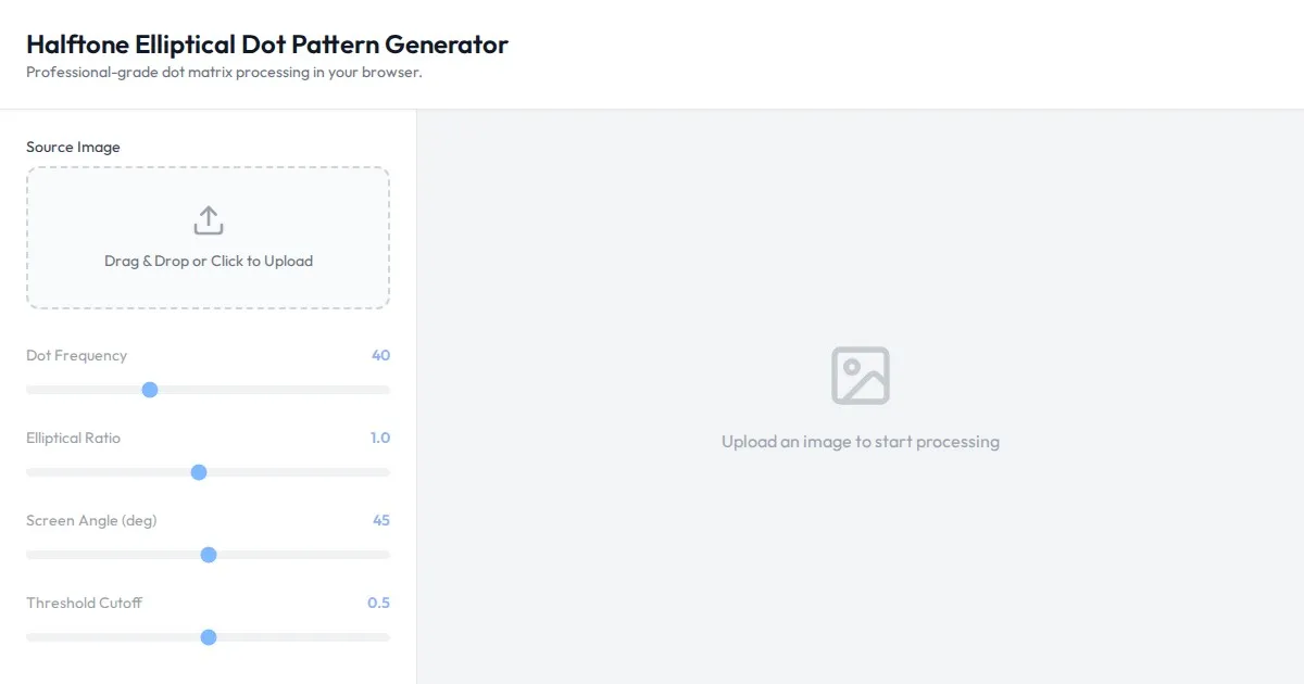
Free Online Halftone Elliptical Dot Pattern Generator
Create professional halftone effects with this free online generator. Customize dot size, elliptical ratio, screen angles, and frequency for print-ready graphics.
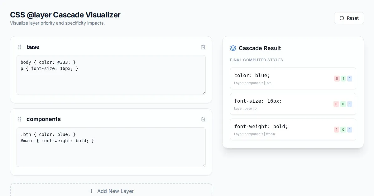
Free CSS @layer Cascade Specificity Ordering Visualizer
Visualize CSS cascade layers and specificity rules easily with this free interactive tool. Debug CSS @layer order, conflicts, and override priority instantly.
Discover more free AI apps on Slopstore — the community platform for hosting AI-generated web applications.