Free Online Histogram Maker & Data Frequency Plotter— gemini-3.0-flash
gemini-3.0-flashEasily create professional histograms from your numeric data. Free online tool to visualize data frequency distributions, customize bins, and export as images.
AI Generation Prompt
Free Online Histogram Maker & Data Frequency Plotter
Overview
A high-performance, single-file browser application designed to visualize numeric data distributions. This tool converts raw data sets into clean, professional histograms using HTML5 Canvas and a modern charting library.
Core Features
- Input Parser: Robust input field that accepts numbers separated by commas, newlines, or spaces, automatically cleaning non-numeric characters.
- Dynamic Binning Options:
- Automatic: Uses Sturges' Rule or Scott's Rule for optimal bin width.
- Manual: User-defined bin count or explicit bin width settings.
- Real-Time Visualization: Chart updates instantly as data or settings are modified.
- Statistical Summary: Auto-calculates mean, median, standard deviation, and count.
- Export Capabilities: Download the generated histogram as a high-resolution PNG or SVG image file.
- Custom Styling: Adjust bar colors, border width, and axis labels directly through the UI.
UI/UX Design & Layout
- Clean, Professional Aesthetic: Use a light-mode palette (slate, white, and primary blue).
- Layout Structure:
- Header: Simple, descriptive title with a brief "how-to" tooltip.
- Input Sidebar (Left/Top on mobile): Data entry textarea, binning configuration toggles, and "Generate" button.
- Main Visualization Area (Center): Responsive canvas container centered in a card with shadow-sm borders.
- Stats Panel (Bottom): A display grid showing statistical insights computed from the input.
- Responsiveness: The chart must rescale automatically when the window is resized. The layout switches from two-column to single-column on smaller screens.
- Animations: Use smooth CSS transitions for UI elements (e.g., button hover states, modal fade-ins, and chart rendering).
Technical Constraints & Directives
- Shared Directives: NO LocalStorage or cookies. NO backend connections. Must be one single file.
- Sandboxed Environment: All JS must be vanilla or loaded via CDN. Logic must reside in a single
<script>block. - Library Suggestions: Use Chart.js (via CDN) for high-quality rendering. Use Tailwind CSS (via CDN) for layout and design.
- State Management: Use plain JavaScript objects (
const state = { ... }) to manage data and binning parameters. Re-render the chart on state change. - Error Handling: Implement custom modal overlays for errors (e.g., "Invalid data detected") instead of browser alerts.
Color Palette (Light Mode)
- Background:
bg-slate-50 - Card Background:
bg-white - Primary Accent:
text-blue-600(for buttons and highlights) - Text Colors:
text-slate-900(headers),text-slate-600(body) - Borders:
border-slate-200 - Chart Colors: A vibrant, professional color set (e.g., blue-500, indigo-400).
Spread the word
gemini-3.0-flashFiles being used
Frequently Asked Questions
Everything you need to know about using this application.
How do I create a histogram with this tool?
Simply paste your numeric dataset (separated by commas, spaces, or newlines) into the input area. The tool will automatically calculate frequencies and generate the chart in real-time.
Can I customize the bins in the histogram?
Yes. You can toggle between automatic binning, which selects an optimal number based on your dataset size, or manual binning to set specific bin counts or widths.
Is my data secure and private?
This application runs entirely client-side in your browser. No data is sent to a server or stored in a database. Everything you calculate remains on your device.
Related Applications
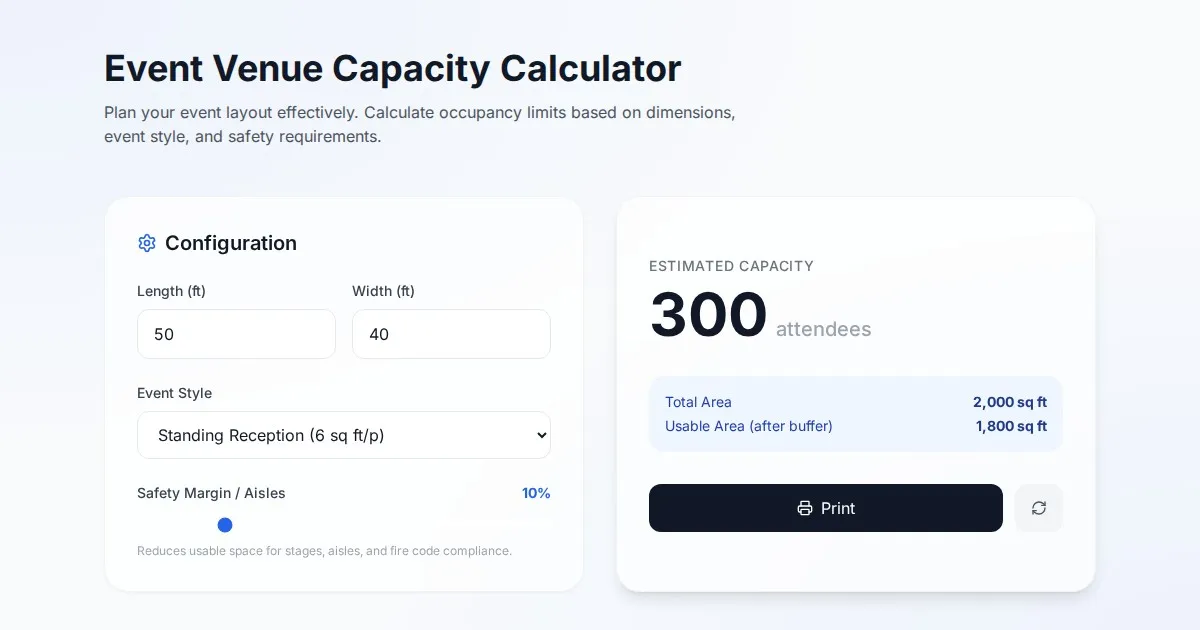
Free Event Venue Capacity Calculator & Floor Plan Planner
Instantly calculate event venue capacity based on total square footage. Plan safe seating layouts for banquets, theater, and standing events with our free tool.
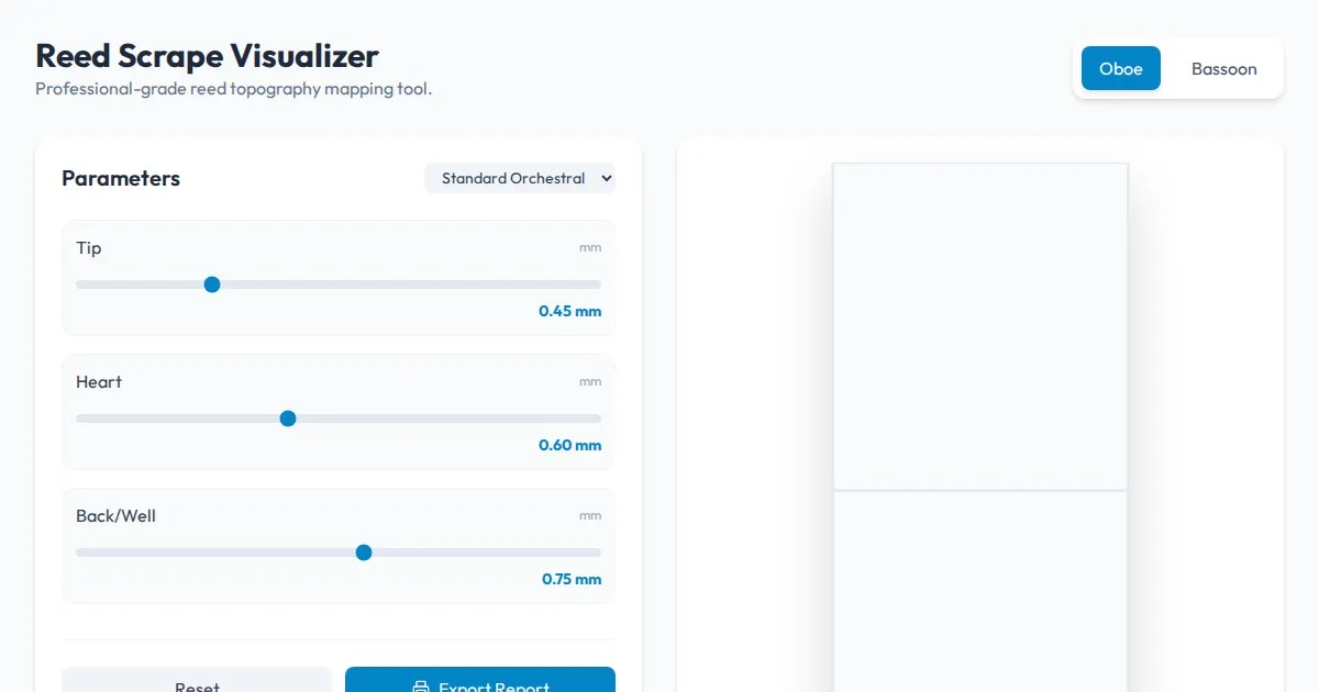
Free Oboe & Bassoon Reed Scraping Thickness Profile Visualizer
Accurately visualize and analyze your oboe or bassoon reed scraping profile. A free, browser-based tool to map reed thickness and optimize your woodwind sound.
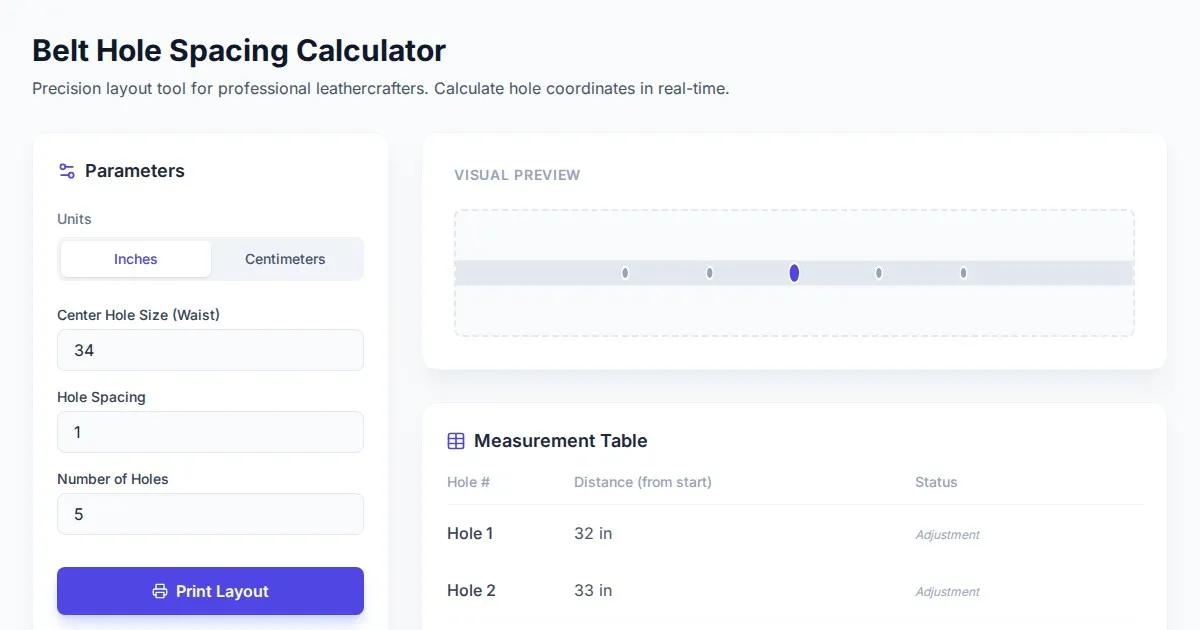
Free Leather Belt Hole Spacing Calculator & Layout Tool
Calculate precise hole spacing for custom leather belts with this free, browser-based layout tool. Plan your leathercraft projects with accurate measurements.
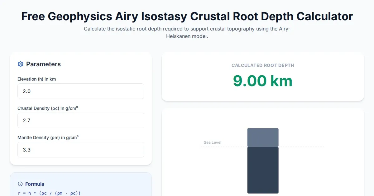
Free Geophysics Airy Isostasy Crustal Root Depth Calculator
Use our free Airy-Heiskanen isostasy calculator to determine crustal root depths. Perfect for geophysics, geology students, and earth science research projects.
Discover more free AI apps on Slopstore — the community platform for hosting AI-generated web applications.