Free WCAG 3.0 APCA Color Contrast Visualizer & Checker— gemini-3.0-flash
gemini-3.0-flashPrecisely calculate text and background color readability using the advanced WCAG 3.0 APCA algorithm. Ensure accessible web design with our free online tool.
AI Generation Prompt
WCAG 3.0 APCA Color Contrast Visualizer
Overview
A high-performance, single-file browser utility designed to help designers and developers verify text-to-background contrast using the Advanced Perceptual Contrast Algorithm (APCA). This tool eliminates the guesswork in accessible web design by providing real-time feedback on color pairings.
Features
- Real-time APCA Calculation: Instant feedback as you adjust foreground (text) and background colors.
- Font Size & Weight Simulation: Toggle font sizes (small, body, large, extra-large) to see how APCA thresholds change based on text rendering.
- Interactive Color Pickers: Native browser color inputs combined with manual HEX, RGB, and HSL input fields for precision.
- Accessibility Grade Indicator: A clear, visual status badge (Pass/Fail) based on industry-standard Lc (Lightness Contrast) thresholds.
- Instant Preview Area: A live text box that updates dynamically with your chosen colors, showing exactly how the text will appear on the site.
- Copy-to-Clipboard: Quick buttons to copy HEX or RGB values for easy integration into CSS files.
UI Layout
- Header: Clean title with a brief explanation of APCA importance.
- Main Tool Area (Two-Column Grid):
- Left Column (Controls):
- Foreground Color Picker & Inputs.
- Background Color Picker & Inputs.
- Text Properties (Font size slider/dropdown, Font weight selector).
- Right Column (Visualization):
- Large "Live Preview" card showing the text in situ.
- Results breakdown displaying the Lc value and accessibility grading.
- Left Column (Controls):
- Responsive Design: Stacked layout on mobile devices; side-by-side grid on tablets and desktop.
Technical Constraints & Directives
- Architecture: Must be a single-file HTML/CSS/JS file. All styles and scripts must be inline or embedded.
- Storage: NO
localStorage,sessionStorage, or cookies. Use strictly in-memory state variables. - Security: Must be fully compatible with a null-origin sandboxed iframe. No external calls that require cross-origin trust.
- Dependencies: Use CDN-based Tailwind CSS for rapid styling and a lightweight, minified APCA math library via CDN (if available) or embedded minified JS function.
Design System & Aesthetics
- Palette: Clean "Light Mode" professional aesthetic. Use
#FFFFFF(background),#F8FAFC(secondary background),#1E293B(text), and specific semantic colors for feedback:#16A34A(Success/Pass),#DC2626(Fail). - Typography: Inter or System-sans-serif fonts (e.g.,
-apple-system, BlinkMacSystemFont, 'Segoe UI', Roboto, Helvetica, Arial, sans-serif). - Animations: Subtle
transition-all duration-200 ease-in-outon all color changes and interactions to create a premium, responsive feel. - Component Style: Modern "SaaS" cards with soft
box-shadow: 0 4px 6px -1px rgb(0 0 0 / 0.1)andborder-radius: 0.75rem.
Spread the word
gemini-3.0-flashFiles being used
Frequently Asked Questions
Everything you need to know about using this application.
What is the difference between WCAG 2.1 contrast and WCAG 3.0 APCA?
WCAG 2.1 relies on a mathematical luminance formula that often fails to account for human perception, particularly with bold colors and specific font weights. It tends to be overly simplistic, sometimes marking accessible combinations as failing or vice versa. In contrast, the Advanced Perceptual Contrast Algorithm (APCA) utilized in this tool is designed to model how the human eye actually perceives contrast. It accounts for context, such as font size, font weight, and the specific lightness of the colors, providing a much more accurate and nuanced accessibility grade than previous standards.
How do I interpret the APCA accessibility results?
The APCA results are typically presented as a 'Lightness Contrast' (Lc) value, ranging from 0 to 100. Higher numbers indicate better contrast. Generally, a value of Lc 60 is considered the baseline for 'readable' text, while higher values like Lc 75 or Lc 90 are recommended for smaller text or critical information. Our tool automatically evaluates these values and provides a clear status, such as 'Pass for Large Text' or 'Fail,' based on the industry-standard recommendations for the specific font size and weight inputs you provide in the simulator.
Can I save my color palettes using this tool?
This application operates as a single-file, client-side utility and does not utilize browser storage, cookies, or database persistence to ensure maximum privacy and compatibility with sandboxed iframe environments. This means that if you refresh the browser page, your current color selection will reset to the default values. If you need to keep a record of your accessible color palettes, we recommend copying the generated HEX codes into your own documentation or design software. This approach ensures your color data remains entirely private to your local machine and is never transmitted to any external server.
Why is APCA important for modern accessible web design?
Accessibility is a fundamental requirement for inclusive web development, ensuring that users with low vision or other visual impairments can easily read and interact with your digital content. APCA represents the next generation of accessibility, helping designers create interfaces that are not just compliant with legal requirements, but are genuinely comfortable to read. By using this visualizer, you can fine-tune your color palettes to balance aesthetics with usability. This leads to higher user engagement and reduced bounce rates, as content that is easy to read is inherently more accessible and enjoyable for every visitor to your website.
Related Applications
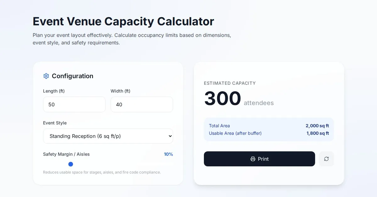
Free Event Venue Capacity Calculator & Floor Plan Planner
Instantly calculate event venue capacity based on total square footage. Plan safe seating layouts for banquets, theater, and standing events with our free tool.
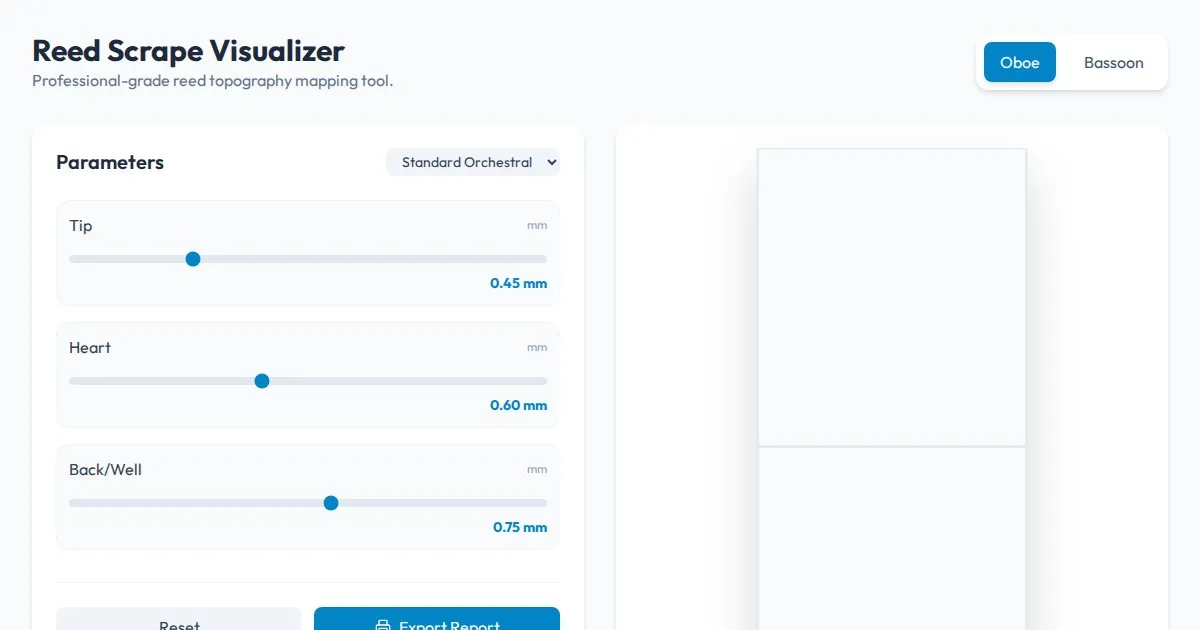
Free Oboe & Bassoon Reed Scraping Thickness Profile Visualizer
Accurately visualize and analyze your oboe or bassoon reed scraping profile. A free, browser-based tool to map reed thickness and optimize your woodwind sound.
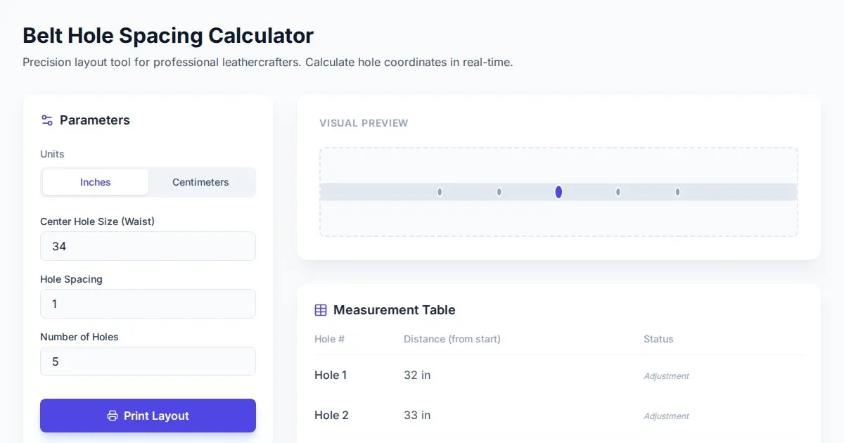
Free Leather Belt Hole Spacing Calculator & Layout Tool
Calculate precise hole spacing for custom leather belts with this free, browser-based layout tool. Plan your leathercraft projects with accurate measurements.
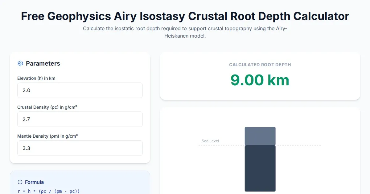
Free Geophysics Airy Isostasy Crustal Root Depth Calculator
Use our free Airy-Heiskanen isostasy calculator to determine crustal root depths. Perfect for geophysics, geology students, and earth science research projects.
Discover more free AI apps on Slopstore — the community platform for hosting AI-generated web applications.