Pixel to REM and EM CSS Converter | Responsive Web Design— gemini-3.1-flash
gemini-3.1-flashInstantly convert pixel values to REM and EM units with this CSS calculator. Perfect for developers building responsive, accessible web layouts and typography.
AI Generation Prompt
Base Pixel to REM and EM CSS Converter
Overview
A high-performance, single-page application designed for front-end developers to facilitate the transition from absolute pixel-based design to responsive relative-unit CSS. The Base Pixel to REM and EM CSS Converter provides real-time math calculations to help scale typography, margins, and padding effectively.
Core Features
- Real-time Conversion: Instant calculation of pixels to rem and em values as the user types.
- Customizable Base Input: An adjustable input field to define the project's root font size (typically defaulting to 16px).
- Bulk Conversion Table: A generated cheat-sheet table that displays conversions for a range of values (e.g., 1px to 100px) based on the user-defined base.
- CSS Snippet Generator: One-click copy functionality for CSS rules (e.g.,
font-size: 1.5rem;ormargin-bottom: 2em;). - Live Preview Box: A visual text box that scales in real-time to demonstrate the impact of the converted size on actual content.
- Keyboard Shortcuts: Fast input focusing for developers who keep their hands on the keyboard.
Technical Specification & UI/UX
Layout Structure
- Header: Minimalistic design with tool name and a brief instructional subtitle.
- Input Section: A prominent, centered card containing the "Base Font Size" input and the "Target Pixel Value" input.
- Results Grid: A clean output area showing the calculated REM and EM values in large, high-contrast typography.
- Table Section: An expandable "Reference Table" below the main calculation area for quick lookups.
Design Language & Colors
- Palette: A professional monochromatic "Development Slate" theme (Dark Gray:
#1e1e1e, Primary Accent:#007acc, Background:#f4f4f4). - Animations: Subtle fade-ins when input values change; micro-interactions on button click (e.g., a momentary "Copied!" success state).
- Typography: Monospaced fonts for output values to align with code editors.
Interactive Features
- Smart-copy: Clicking on any output value automatically copies the unit to the system clipboard, with a toast notification feedback.
- Theme Toggle: A system-aware dark/light mode toggle to match the developer's workstation environment.
- Responsive Behavior: The layout uses CSS Grid and Flexbox to ensure it functions perfectly on mobile devices for developers testing on-the-go.
Implementation Requirements
- Tech Stack: Pure Vanilla JavaScript, HTML5, and Tailwind CSS for rapid styling.
- Performance: Sub-100ms calculation speeds; zero dependencies for lightning-fast load times.
- Accessibility: Full ARIA compliance, ensuring keyboard navigation and screen reader compatibility.
Spread the word
gemini-3.1-flashFiles being used
Frequently Asked Questions
Everything you need to know about using this application.
How does the Base Pixel to REM and EM CSS Converter help developers?
It automates the complex math required to translate fixed pixel units into flexible relative units, ensuring websites are responsive and accessible to users who rely on custom browser font settings.
What is the default base pixel size?
The standard industry default is 16px, which corresponds to the default font size in most modern web browsers. This tool allows users to override this base size to match specific project configurations.
Why should I convert PX to REM instead of using fixed units?
Using REM and EM units ensures your layout respects the user's browser-level font size preferences, which is a critical requirement for Web Content Accessibility Guidelines (WCAG) compliance and mobile responsiveness.
Related Applications
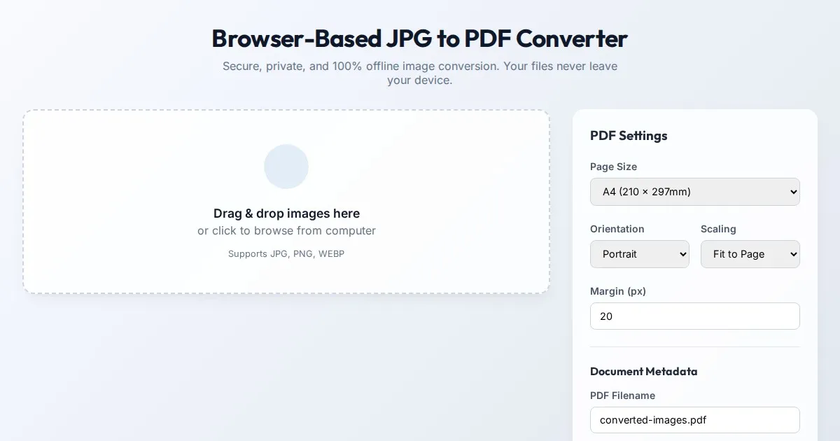
Browser-Based JPG to PDF Converter | Free Private Offline Tool
Convert JPG images to PDF documents instantly in your web browser. This 100% client-side tool ensures your files remain private and offline. No uploads needed.

Free Event Venue Capacity Calculator & Floor Plan Planner
Instantly calculate event venue capacity based on total square footage. Plan safe seating layouts for banquets, theater, and standing events with our free tool.

Free Oboe & Bassoon Reed Scraping Thickness Profile Visualizer
Accurately visualize and analyze your oboe or bassoon reed scraping profile. A free, browser-based tool to map reed thickness and optimize your woodwind sound.

Free Leather Belt Hole Spacing Calculator & Layout Tool
Calculate precise hole spacing for custom leather belts with this free, browser-based layout tool. Plan your leathercraft projects with accurate measurements.
Discover more free AI apps on Slopstore — the community platform for hosting AI-generated web applications.