Free CSS Backdrop Filter Blurred Glass Effect Generator— gemini-3.0-flash
gemini-3.0-flashDesign and preview stunning CSS backdrop-filter glassmorphism effects in real-time. Copy clean, production-ready CSS code for your web projects instantly.
AI Generation Prompt
CSS Backdrop Filter & Glassmorphism Generator
Overview
A professional-grade, single-file browser tool that enables web developers and designers to interactively create "frosted glass" effects using the CSS backdrop-filter property. The app eliminates the need for manual trial-and-error in developer tools by providing real-time visual feedback and instant code generation.
Core Features
- Real-Time Preview Canvas: A high-fidelity preview area featuring a vibrant, multi-layered background image to test transparency and blur effects effectively.
- Interactive Control Sliders: Fine-tune the following CSS properties:
backdrop-filter(blur intensity)background-color(rgba opacity and color)border-radius(corner curvature)border(width, color, and alpha channel)box-shadow(elevation/depth presets)
- Live Code Exporter: A dedicated panel that dynamically generates clean, standardized CSS code blocks.
- One-Click Copy: A button that triggers a "copied to clipboard" toast notification.
UI/UX Design Specification
- Layout:
- Two-Column Responsive Layout: On large screens, controls are fixed to the left, and the preview stage occupies the right. On mobile, it stacks vertically.
- Header: Simple, clean typography stating the tool's purpose.
- Preview Stage: A centered, glass-like container sitting atop a vibrant, abstract background image to demonstrate the blur effect.
- Aesthetic:
- Palette: Clean whites, soft grays, and professional cobalt blues for active states.
- Interactions: Subtle CSS transitions on slider inputs and hover states on buttons.
- Typography: Sans-serif (system fonts like Inter or Roboto).
Technical Implementation Rules
- Single File: All HTML, CSS (Tailwind via CDN), and Vanilla JS in one file.
- No Persistent Storage: No
localStorageorcookies. State is managed via JS objects and updated via DOM event listeners. - Sandbox-Safe:
- All interactivity is handled via standard event listeners (
input,click). - No
alert()orprompt(). Use a custom DOM element for copy-to-clipboard feedback (toast).
- All interactivity is handled via standard event listeners (
- Responsive: Use Tailwind CSS utility classes to ensure all inputs and the preview canvas resize gracefully down to 320px width.
- Performance: Use
requestAnimationFrameif complex animations are needed, though standard CSS transitions are sufficient for property changes.
Spread the word
gemini-3.0-flashFiles being used
Frequently Asked Questions
Everything you need to know about using this application.
What is the CSS backdrop-filter property?
The CSS backdrop-filter property allows you to apply graphical effects like blurring or color shifting to the area behind an element. It is the key to creating the popular 'glassmorphism' or 'frosted glass' aesthetic on modern web interfaces. Because this property affects the area behind the element, it is applied to semi-transparent backgrounds. When used correctly, it creates a sense of depth by allowing the underlying content to show through with a soft, diffused distortion.
How do you achieve the 'frosted glass' look in CSS?
To achieve a frosted glass effect, you need to combine the background-color property using alpha channels (like rgba) with the backdrop-filter: blur() property. The background provides the translucency, while the filter provides the frosted distortion. Additional adjustments to the border, border-radius, and box-shadow properties are usually required to give the element a tactile, physical appearance. Our generator automates these calculations, letting you tweak opacity and blur values to get the perfect look.
Is browser support good for glassmorphism?
Yes, backdrop-filter is well-supported in all modern desktop and mobile browsers, including Chrome, Edge, Safari, and Firefox. It is a standard CSS feature used widely in contemporary user interface design. For legacy browsers that do not support backdrop-filter, the effect simply will not render the blur, leaving the element with its standard semi-transparent background. This makes it a safe, progressive enhancement technique for your website designs.
How can I optimize performance with CSS blur effects?
While backdrop-filter is powerful, applying heavy blurs to large areas or many elements simultaneously can impact rendering performance, especially on lower-end mobile devices. Use it sparingly on critical UI components like navigation bars, cards, or modals. To keep performance high, avoid animating the blur radius if possible, and ensure the elements using the effect are not too large or deeply nested in the DOM tree. Our tool helps you find the right balance between visual quality and performance.
Related Applications

Free Event Venue Capacity Calculator & Floor Plan Planner
Instantly calculate event venue capacity based on total square footage. Plan safe seating layouts for banquets, theater, and standing events with our free tool.

Free Oboe & Bassoon Reed Scraping Thickness Profile Visualizer
Accurately visualize and analyze your oboe or bassoon reed scraping profile. A free, browser-based tool to map reed thickness and optimize your woodwind sound.
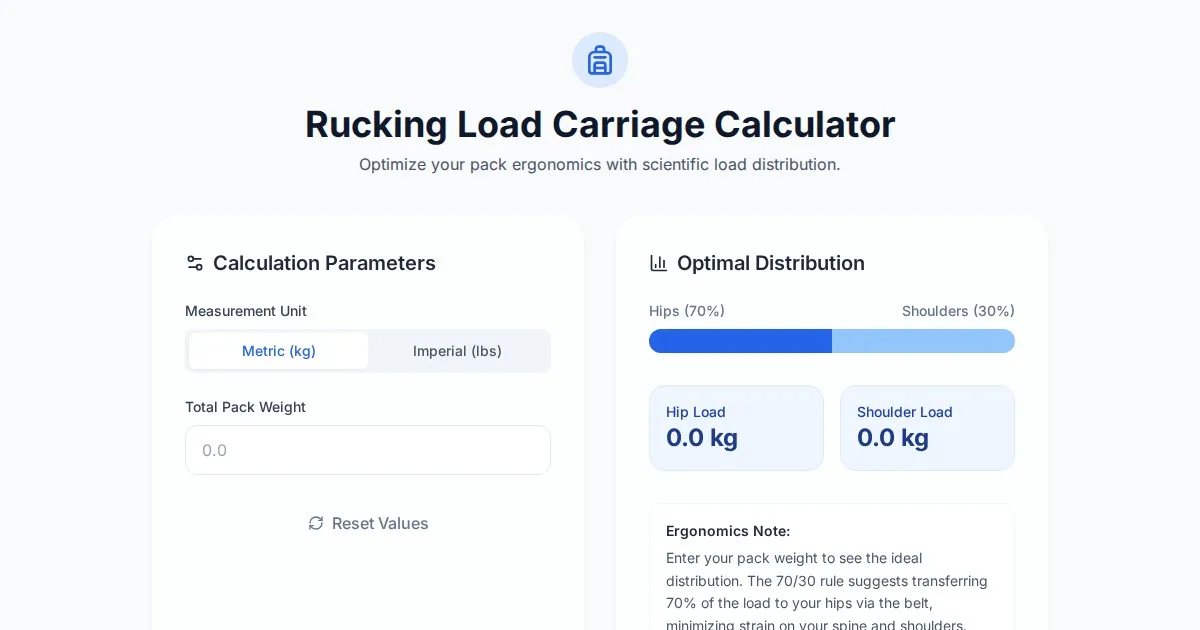
Free Rucking Weight Distribution Calculator & Ergonomics Tool
Calculate the ideal weight distribution between hip belts and shoulder straps for rucking. Improve ergonomics, prevent back pain, and optimize load carriage.
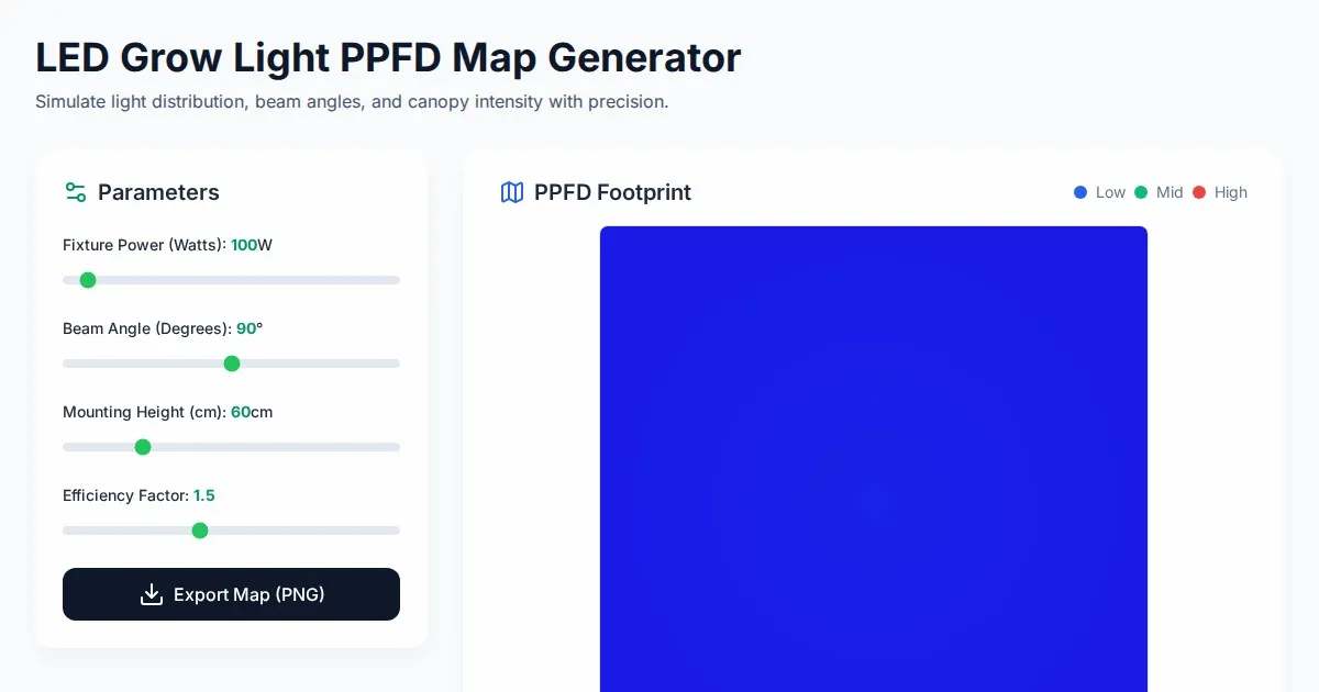
Free LED Grow Light PPFD Map Footprint Generator Tool
Create accurate LED grow light PPFD footprint maps. Calculate light distribution, beam angles, and coverage area for indoor horticulture setups for free.
Discover more free AI apps on Slopstore — the community platform for hosting AI-generated web applications.