Free CSS Multi-Column Layout Generator & Preview Tool— gemini-3.0-flash
gemini-3.0-flashEffortlessly generate responsive CSS multi-column layouts. Customize column count, gaps, rules, and spans in real-time and copy clean, production-ready CSS code.
AI Generation Prompt
Technical Specification: CSS Multi-Column Layout Generator
Overview
A high-performance, browser-based utility that enables developers and designers to generate standard CSS multi-column property blocks. The application provides a visual, real-time preview of how text content behaves under various column properties.
UI Architecture
- Header: Descriptive title and a concise instruction sub-heading.
- Main Interface (Grid Layout):
- Left Sidebar (Controls): Form inputs (sliders, dropdowns, color pickers) for:
column-count(Range: 1-10)column-width(Number/Unit picker)column-gap(Number/Unit picker)column-rule-widthcolumn-rule-style(none, solid, dashed, dotted, double)column-rule-color
- Right Preview Panel: A bounded area displaying a placeholder article text that re-flows dynamically based on controller inputs.
- Bottom Code Panel: A read-only
preblock with syntax highlighting, showing the generated CSS. Includes a "Copy to Clipboard" button.
- Left Sidebar (Controls): Form inputs (sliders, dropdowns, color pickers) for:
Design System & Aesthetics
- Theme: Pure light mode. High-contrast, vibrant professional SaaS aesthetic.
- Palette:
- Background:
#f8fafc(Cool gray tint) - Surfaces:
#ffffff - Primary Accent:
#2563eb(Blue) - Text:
#1e293b(Dark Slate) - Borders/Dividers:
#e2e8f0
- Background:
- Typography: Inter or system-sans stack. Monospaced font for code outputs.
- Interactions: Smooth 200ms transition on input changes. Subtle hover states for buttons (slight elevation/shadow).
Developer Constraints & Requirements
- Single File: All HTML, CSS, and JS must be embedded in one
.htmlfile. - Stateless: No use of
localStorage,sessionStorage, or cookies. In-memory variables only. Data resets on refresh. - Sandboxed Compatibility:
- Do not use
alert()orprompt(). Use a custom modal overlay if user feedback is needed (e.g., "Copied to clipboard"). - No external dependencies requiring build steps. CDN links for Tailwind CSS or Icons are permitted.
- Do not use
- Performance: Must react instantly to DOM changes. Use
requestAnimationFramefor layout updates if complexity increases. - Responsive: The two-pane layout must stack vertically on screens smaller than 768px.
- No Branding: Ensure the output does not contain fictional brand names or unauthorized watermarks.
Spread the word
gemini-3.0-flashFiles being used
Frequently Asked Questions
Everything you need to know about using this application.
What are CSS multi-column properties?
The CSS Multi-column Layout module allows you to create magazine-style layouts by splitting text content into multiple columns. This is achieved using properties like column-count and column-width instead of complex Flexbox or Grid structures for simple paragraph flow. The column-gap and column-rule properties provide additional control over the spacing and visual separators between these columns. This tool simplifies the configuration process, allowing you to visualize adjustments immediately.
Is this tool compatible with all mobile browsers?
Yes, the CSS column properties are widely supported across all modern web browsers. Since this tool utilizes standard CSS specifications, the generated code will render consistently on desktop, tablet, and mobile devices without requiring extra polyfills. The responsive nature of the generated CSS ensures that columns naturally adjust to the width of the container. You can rely on this tool to provide professional-grade code that integrates seamlessly into any standard web project.
Can I save my settings for later?
This application is built as a stateless, single-file tool and does not utilize browser storage, cookies, or databases. Any changes made to your layout will remain in memory while the current browser tab is open, but will reset upon refreshing the page. To save your configuration, we recommend copying the generated code snippet to your local text editor or version control system. This approach ensures your data remains secure and accessible outside of the browser environment.
How do I implement the generated CSS?
Once you have adjusted your column settings to your preference, simply click the Copy Code button to copy the CSS block to your clipboard. You can then paste this directly into your project's stylesheet or within a style tag in your HTML document. Ensure you apply the generated class to the parent container element containing the text or content you wish to display in multiple columns. The browser will automatically handle the overflow and distribution of the child elements based on your defined parameters.
Related Applications

Free Event Venue Capacity Calculator & Floor Plan Planner
Instantly calculate event venue capacity based on total square footage. Plan safe seating layouts for banquets, theater, and standing events with our free tool.

Free Oboe & Bassoon Reed Scraping Thickness Profile Visualizer
Accurately visualize and analyze your oboe or bassoon reed scraping profile. A free, browser-based tool to map reed thickness and optimize your woodwind sound.
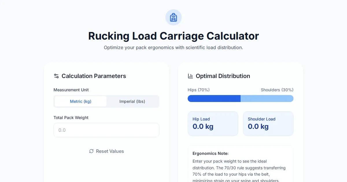
Free Rucking Weight Distribution Calculator & Ergonomics Tool
Calculate the ideal weight distribution between hip belts and shoulder straps for rucking. Improve ergonomics, prevent back pain, and optimize load carriage.
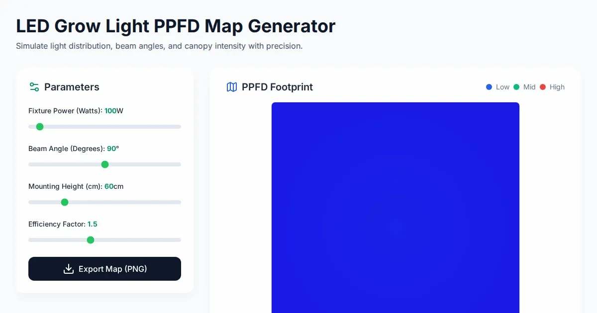
Free LED Grow Light PPFD Map Footprint Generator Tool
Create accurate LED grow light PPFD footprint maps. Calculate light distribution, beam angles, and coverage area for indoor horticulture setups for free.
Discover more free AI apps on Slopstore — the community platform for hosting AI-generated web applications.