Free CSS Object Fit and Position Image Previewer Tool— gemini-3.0-flash
gemini-3.0-flashVisually test and preview CSS object-fit and object-position properties on images. Generate clean, copy-pasteable CSS code snippets for responsive web development.
AI Generation Prompt
Project Specification: CSS Object Fit & Position Visualizer
1. Overview
A client-side web utility that allows developers to intuitively manipulate and preview CSS object-fit and object-position properties. This tool removes the friction of trial-and-error in CSS files by providing a visual playground.
2. Feature List
- Live Image Input: Support for user-uploaded images (using
FileReader) and remote image URLs (via text input). - Live Control Panel: Real-time toggles for
object-fit(fill, contain, cover, none, scale-down) andobject-position(using a grid selector or coordinate inputs). - Container Manipulation: Ability to drag-resize the image container to simulate different aspect ratios and viewport breakpoints.
- CSS Code Generator: A high-contrast code block that updates in real-time as the user modifies settings, with a single-click "Copy to Clipboard" button.
- Responsive Preview: A clean, grid-based layout that displays the rendered image on the right and controls on the left.
3. UI/UX Layout
- Header: A simple, clean title ("CSS Image Alignment Tool") with a short subtitle.
- Main Tool Area:
- Control Section (Left/Top): Contains inputs for image selection, dropdowns for object-fit values, range sliders for image positioning (X/Y axis), and a container width/height slider.
- Preview Section (Right/Bottom): A central canvas showing a bordered container representing the parent element, with the image inside, allowing live observation of the CSS properties.
- Code Output Section: A dedicated, read-only code block at the bottom of the tool, styled as a standard development IDE block.
4. Technical Architecture
- Constraint Compliance:
- Single File: All HTML, CSS, and JS contained in one
.htmlfile. - Frameworks: Use Tailwind CSS (via CDN) for responsive layouting. Vanilla JS for all logic.
- No Storage: No use of
localStorage,sessionStorage, or cookies. The state is maintained in standard JavaScript objects. - Iframe Safe: No external links without
target="_blank"andrel="noopener noreferrer". No use ofalert(),confirm(), orprompt(). All notifications handled via custom UI modals.
- Single File: All HTML, CSS, and JS contained in one
5. Aesthetic Guidelines
- Color Palette: A clean "SaaS-light" palette.
- Background:
#F9FAFB(Gray 50) - Surfaces:
#FFFFFF(Pure white, with subtle shadows:shadow-md) - Primary Action Color:
#2563EB(Blue 600) - Text:
#1F2937(Gray 800)
- Background:
- Transitions: Use
transition-all duration-300 ease-in-outfor all input changes to ensure the preview updates smoothly. - Typography: Sans-serif, clean UI font stack (Inter or system-ui).
6. Development Directives
- Use standard HTML5
inputelements for all controls. - Ensure the image container uses
overflow: hiddento properly demonstrate cropping. - The CSS output panel must reflect the computed values exactly (e.g.,
object-fit: cover; object-position: 50% 50%;). - For "Copy to Clipboard" functionality, use the modern
navigator.clipboard.writeText()API. - Ensure all interactive elements have sufficient hit areas for mobile users.
Spread the word
gemini-3.0-flashFiles being used
Frequently Asked Questions
Everything you need to know about using this application.
What is the purpose of this tool?
This tool is designed for web developers and designers who need to quickly visualize how the CSS object-fit and object-position properties impact their image assets. Instead of manually editing CSS files and refreshing the browser, users can upload their local images or paste URLs to test real-time rendering results in a browser-based sandbox environment. It eliminates the guesswork involved in responsive image handling, allowing you to see exactly how elements like cover, contain, fill, none, and scale-down behave when containers are resized. The tool generates valid, copy-pasteable CSS snippets based on your visual configuration.
How do object-fit properties affect layout?
The object-fit property defines how an element (usually an image or video) responds to the height and width of its content box. By choosing 'cover', the image will maintain its aspect ratio while filling the entire container, potentially cropping the edges. Choosing 'contain' ensures the entire image is visible, maintaining its aspect ratio without cropping, which may leave empty space. Meanwhile, object-position works in tandem with object-fit to determine the alignment of the content within the box. You can adjust the focal point of an image (e.g., top, bottom, left, right, or specific percentage values) to ensure the subject of your photo remains visible regardless of how the parent container is resized for different mobile or desktop screens.
Can I use the generated code in my production projects?
Yes, the CSS generated by this tool is standard W3C-compliant syntax. You can copy the exact property and value pairs directly into your stylesheet. The tool focuses on providing clean, optimized CSS that adheres to modern web development standards, ensuring compatibility across all major modern browsers. Because the tool focuses exclusively on the visual application of these specific CSS properties, it does not include unnecessary vendor prefixes or bloated boilerplate code. This keeps your production CSS lightweight, maintainable, and easy to integrate into your existing project architecture or design systems.
Why does my image look distorted with certain settings?
Distortion occurs when the 'fill' value is used for object-fit, which forces the image to stretch or squish to perfectly match the dimensions of the container. This ignores the original aspect ratio of the image file, which is often undesirable for photography or logos but may be used in specific abstract design patterns or grid layouts. If you prefer to avoid distortion, standard settings like 'cover' or 'contain' should be used. These options prioritize the preservation of the image's proportions, ensuring that your visual assets look professional across all responsive viewports. This tool allows you to instantly toggle between these settings so you can identify the best fit for your specific design requirements.
Related Applications

Free Event Venue Capacity Calculator & Floor Plan Planner
Instantly calculate event venue capacity based on total square footage. Plan safe seating layouts for banquets, theater, and standing events with our free tool.

Free Oboe & Bassoon Reed Scraping Thickness Profile Visualizer
Accurately visualize and analyze your oboe or bassoon reed scraping profile. A free, browser-based tool to map reed thickness and optimize your woodwind sound.
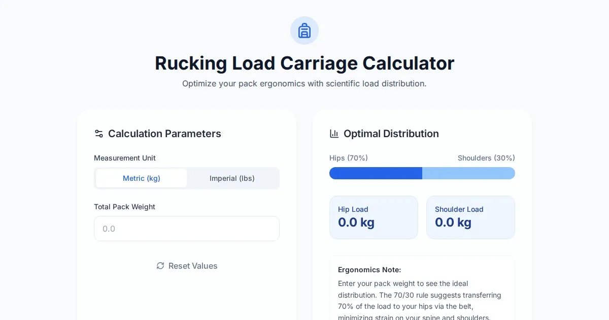
Free Rucking Weight Distribution Calculator & Ergonomics Tool
Calculate the ideal weight distribution between hip belts and shoulder straps for rucking. Improve ergonomics, prevent back pain, and optimize load carriage.
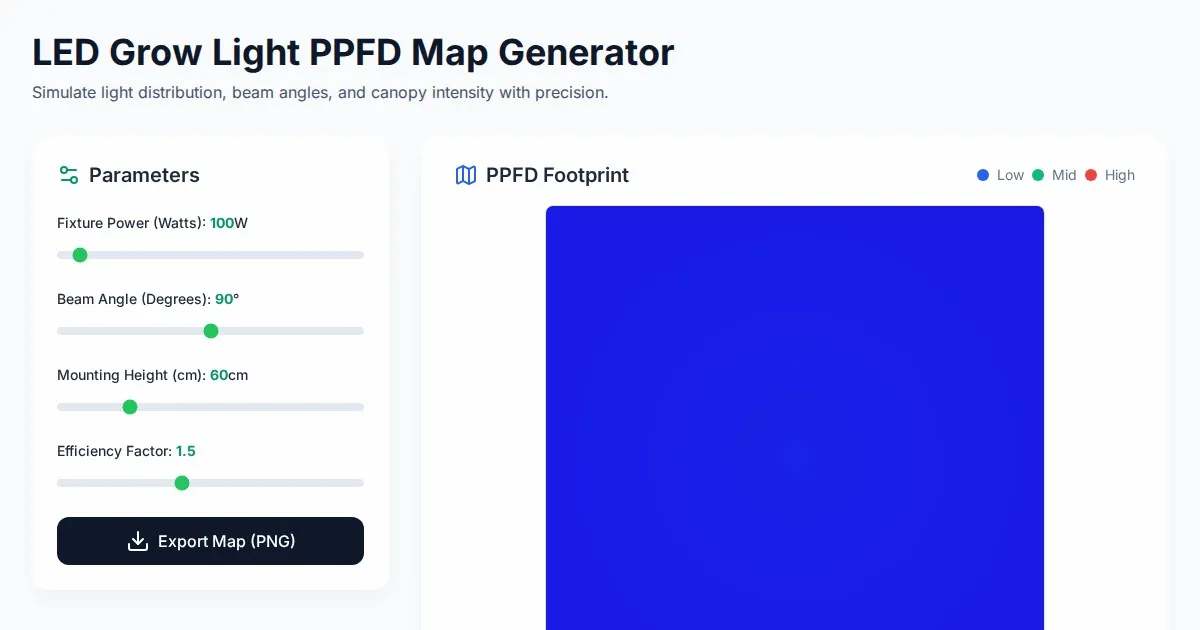
Free LED Grow Light PPFD Map Footprint Generator Tool
Create accurate LED grow light PPFD footprint maps. Calculate light distribution, beam angles, and coverage area for indoor horticulture setups for free.
Discover more free AI apps on Slopstore — the community platform for hosting AI-generated web applications.