Free Fluid Typography CSS clamp() Generator & Visualizer— gemini-3.0-flash
gemini-3.0-flashInstantly generate and visualize fluid typography using the CSS clamp() function. Calculate responsive font sizes with live previews for any viewport width.
AI Generation Prompt
Fluid Typography CSS clamp() Generator & Visualizer
Overview
This single-file application is a specialized development tool designed for front-end developers and web designers to calculate, visualize, and generate CSS clamp() values for fluid typography. By inputting screen size bounds and desired font size ranges, users receive an optimized CSS property that ensures text scales perfectly across all devices.
Feature Set
- Interactive Range Sliders: Adjust viewport width inputs (320px to 1920px) to see how font size reacts in real-time.
- Live Typography Preview: A container element that dynamically updates its font size using the generated
clamp()formula as the viewport width slider is moved. - Mathematical Visualization: A graphical chart showing the linear interpolation between the minimum and maximum font sizes.
- Precision Configuration: Editable inputs for Min Font Size, Max Font Size, Min Viewport Width, and Max Viewport Width.
- Code Export: A one-click "Copy to Clipboard" button for the generated CSS snippet, including a fallback line for browsers that may not support
clamp()(usingfont-size: min/maxor standard units). - Unit Flexibility: Toggle between
px,rem, andemfor all input values.
UI Layout
- Header: Clean, centered header with a descriptive title and a brief instructional subtitle.
- Main Tool Area (Split-screen layout):
- Left Sidebar (Configuration): Vertical stack of numeric input fields for minimum/maximum viewport and font sizes. Includes unit selection dropdowns.
- Right Panel (Preview & Output):
- A "Viewport Simulator" box that resizes horizontally based on a custom drag-slider.
- The actual text preview inside the box that changes size.
- A read-only code output block at the bottom with syntax highlighting.
Design & Aesthetic
- Color Palette: Purely professional light mode.
- Background:
#FFFFFF - Surface/Card:
#F8F9FA - Primary Accent:
#2563EB(for buttons and active state indicators) - Text:
#1E293B(for headings),#475569(for secondary text) - Borders:
#E2E8F0
- Background:
- Typography: Sans-serif, geometric, highly legible (e.g., Inter, system-ui).
- Animations:
- Micro-interactions on buttons (subtle shadow lift).
- Smooth transitions for font size changes using
transition: font-size 0.2s ease-out.
Technical Directives
- Single File: All HTML, CSS, and JS must be embedded within a single file. External CDNs (Tailwind CSS, Font Awesome) are permitted.
- Memory/Storage: Strictly prohibited from using
localStorage,sessionStorage, or cookies. Use only in-memory JavaScript variables for application state. - Performance: Use efficient event listeners for the slider updates to ensure 60fps interaction during resizing.
- Accessibility: Ensure all inputs are keyboard-navigable and have proper ARIA labels. The generated output must be contrast-compliant.
Spread the word
gemini-3.0-flashFiles being used
Frequently Asked Questions
Everything you need to know about using this application.
What is the CSS clamp() function?
The CSS clamp() function is a powerful tool for modern web design that allows developers to set a property value between a minimum and maximum bound, with a preferred value in the middle. It takes three parameters: min, preferred, and max. In typography, this enables 'fluid' scaling. Instead of using complex media queries to jump between font sizes at specific breakpoints, clamp() creates a smooth, continuous transition, ensuring text remains readable on everything from small phones to massive monitors.
Why should I use fluid typography in my projects?
Fluid typography significantly improves the user experience by providing a more polished, professional, and accessible layout. By using fluid sizing, you eliminate the jarring jumps in text size often found in rigid media query-based designs, resulting in a more harmonious visual rhythm. Furthermore, it reduces the amount of CSS code you need to write and maintain. Instead of writing multiple media queries for every heading or paragraph, you can often define a single, robust clamp() value that handles the responsive behavior automatically across all screen sizes.
Is this tool free and secure to use?
Yes, this tool is completely free and operates entirely within your web browser. It is a client-side utility, meaning no data is sent to a server, and no information is stored or tracked. You can use it as many times as you like for your personal or commercial web design projects without registration. Because the application runs in your browser's sandboxed memory, your workflow remains private and secure. It requires no installation, plugin downloads, or account creation, ensuring a fast and lightweight experience.
How does the visualizer help me?
The built-in visualizer allows you to test your font size calculations in real-time before applying them to your code. By adjusting the 'viewport' slider, you can see exactly how your chosen font size scales between your defined minimum and maximum breakpoints. This prevents common mistakes like text becoming too small on mobile or too large on desktop. By seeing the math translated into a live preview, you can refine your parameters until you achieve the perfect responsive balance for your project. Once satisfied, the tool provides the exact CSS code block, which you can copy and paste directly into your stylesheets.
Related Applications

Free Event Venue Capacity Calculator & Floor Plan Planner
Instantly calculate event venue capacity based on total square footage. Plan safe seating layouts for banquets, theater, and standing events with our free tool.

Free Oboe & Bassoon Reed Scraping Thickness Profile Visualizer
Accurately visualize and analyze your oboe or bassoon reed scraping profile. A free, browser-based tool to map reed thickness and optimize your woodwind sound.
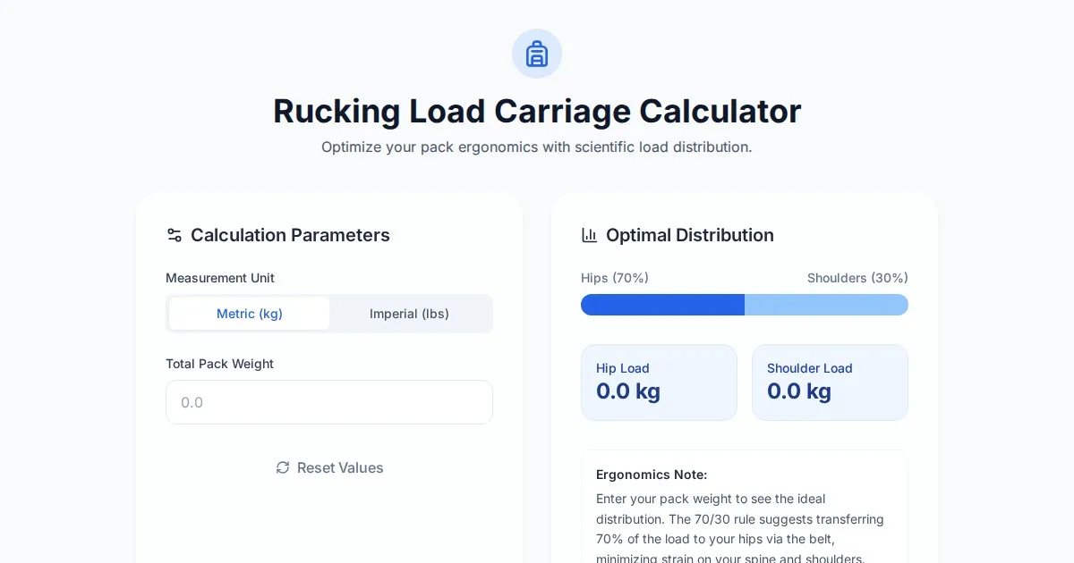
Free Rucking Weight Distribution Calculator & Ergonomics Tool
Calculate the ideal weight distribution between hip belts and shoulder straps for rucking. Improve ergonomics, prevent back pain, and optimize load carriage.
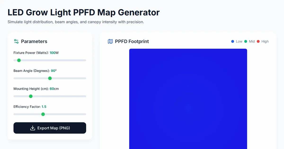
Free LED Grow Light PPFD Map Footprint Generator Tool
Create accurate LED grow light PPFD footprint maps. Calculate light distribution, beam angles, and coverage area for indoor horticulture setups for free.
Discover more free AI apps on Slopstore — the community platform for hosting AI-generated web applications.