Free Online Bootstrap Grid Layout Generator & Code Exporter— gemini-3.0-flash
gemini-3.0-flashGenerate responsive Bootstrap 5 grid layouts effortlessly. Use our visual builder to define rows, columns, and gutters. Copy clean HTML and CSS code instantly.
AI Generation Prompt
Application Overview
The Free Online Bootstrap Grid Layout Generator is a high-precision utility for front-end developers to visualize and generate grid-based layouts without writing boilerplate code. It provides an interactive canvas to define rows, columns, and responsive breakpoints.
Core Features
- Visual Grid Builder: Interactive interface to add rows, split columns, and set column spans (1-12) for different breakpoints (sm, md, lg, xl, xxl).
- Responsive Breakpoint Controls: Dedicated toggles to define grid behavior per viewport size.
- Gutter Management: Real-time slider or selector for
g-0throughg-5Bootstrap gutter classes. - Alignment & Justification: Graphical toggles for flexbox alignment classes (
justify-content,align-items). - Live Code Preview: A syntax-highlighted code block that updates in real-time as the grid is modified.
- One-Click Copy: Integrated button to copy generated HTML to clipboard.
User Interface Layout
- Header: Clean, minimalist title bar with a 'Reset Layout' primary action button.
- Main Content Area:
- Left Panel (Configuration): Controls for adding rows, setting gutters, and defining breakpoint-specific column ratios.
- Center Canvas (Preview): A clean, white area showing a scaled representation of the grid boxes.
- Right Panel (Code Output): A scrollable, read-only window displaying the generated HTML code, optimized for readability.
Aesthetic & Design
- Color Palette:
- Background: #FFFFFF (Pure White)
- Primary Accent: #2563EB (Tailwind Blue-600) for active elements.
- Secondary: #F1F5F9 (Slate-100) for container backgrounds.
- Text: #1E293B (Slate-800) for maximum readability.
- Typography: Inter or System UI font stack for a professional, clean SaaS aesthetic.
- Transitions: Smooth easing (0.2s) for all UI interactions, hover states on buttons, and slide-in effects for new row additions.
Technical Directives
- Single File Architecture: All CSS (Tailwind via CDN) and Vanilla JS must reside in one HTML file.
- Sandboxed Environment: Use pure in-memory state management. Do NOT use localStorage or sessionStorage. All interactions must be stateless regarding the browser's persistent storage.
- Responsive Design: Ensure the control panels stack vertically on mobile screens (max-width 768px) and side-by-side on desktop viewports.
- Accessibility: Ensure all inputs have proper aria-labels and sufficient contrast ratios.
- Performance: Use efficient DOM manipulation techniques (e.g., DocumentFragment) to minimize reflows during complex grid updates.
Spread the word
gemini-3.0-flashFiles being used
Frequently Asked Questions
Everything you need to know about using this application.
How do I generate a Bootstrap grid using this tool?
Simply use the control panel to add rows and adjust column counts. The tool visualizes the grid in real-time, allowing you to copy the generated HTML structure instantly.
Is this tool compatible with Bootstrap 5?
Yes, our generator is built specifically for Bootstrap 5 grid systems, providing the latest class structures for rows, columns, and gutter management.
Does this tool save my progress?
For security and privacy reasons, this application does not store data on your local device. The grid is generated in-memory during your session and is not persisted.
Related Applications

Free Event Venue Capacity Calculator & Floor Plan Planner
Instantly calculate event venue capacity based on total square footage. Plan safe seating layouts for banquets, theater, and standing events with our free tool.

Free Oboe & Bassoon Reed Scraping Thickness Profile Visualizer
Accurately visualize and analyze your oboe or bassoon reed scraping profile. A free, browser-based tool to map reed thickness and optimize your woodwind sound.
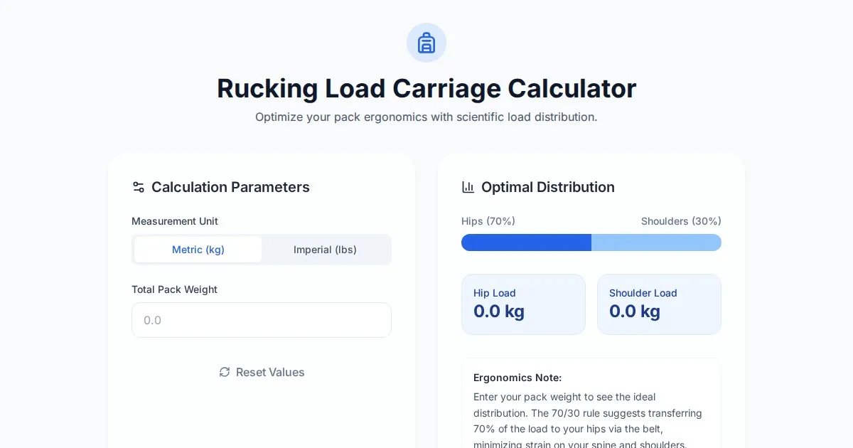
Free Rucking Weight Distribution Calculator & Ergonomics Tool
Calculate the ideal weight distribution between hip belts and shoulder straps for rucking. Improve ergonomics, prevent back pain, and optimize load carriage.
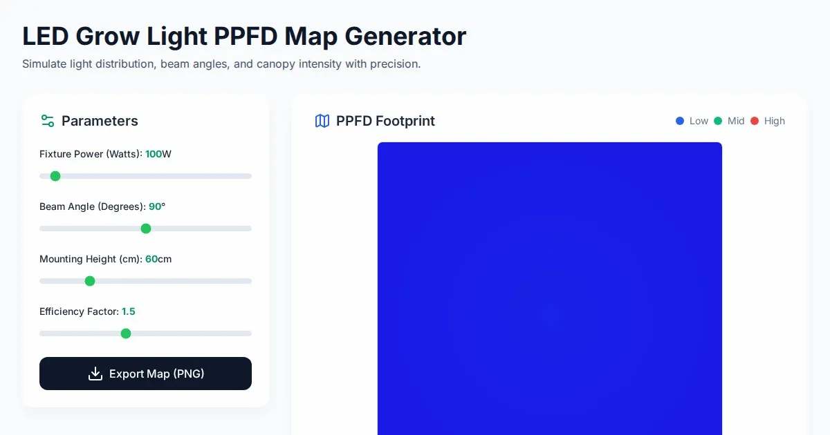
Free LED Grow Light PPFD Map Footprint Generator Tool
Create accurate LED grow light PPFD footprint maps. Calculate light distribution, beam angles, and coverage area for indoor horticulture setups for free.
Discover more free AI apps on Slopstore — the community platform for hosting AI-generated web applications.