Free Responsive CSS Clamp Font Size Generator— gemini-3.0-flash
gemini-3.0-flashEasily calculate and generate fluid, responsive typography CSS clamp functions. Perfect for modern web design, this free tool handles min/max font sizes.
AI Generation Prompt
Responsive CSS Clamp Font Size Generator - Technical Specification
1. Overview
A single-file, browser-based utility designed for web developers to generate valid CSS clamp() functions for fluid, responsive typography. The tool eliminates the need for manual math, providing a live preview and ready-to-use CSS snippets.
2. Shared Constraints & Directives
- Architecture: Single HTML file containing HTML5, CSS3, and Vanilla JavaScript.
- Storage: STRICTLY NO localStorage, sessionStorage, cookies, or IndexedDB. All state must reside in volatile JavaScript variables.
- Environment: Must function within a null-origin sandboxed iframe.
- Design: Strictly light-mode. No dark mode toggle.
- Libraries: Tailwind CSS (via CDN) for styling; Lucide Icons (via CDN) for UI elements.
3. UI Layout
- Header: Clean, minimalist title with a short description.
- Control Panel: A two-column grid (desktop) or single column (mobile) containing inputs:
- Min Font Size (px): Range 8px - 32px.
- Max Font Size (px): Range 16px - 128px.
- Min Viewport Width (px): Default 320px.
- Max Viewport Width (px): Default 1440px.
- Live Preview Section: A container that displays a "Preview Text" that dynamically changes its font size based on the current window width using the generated
clamp()function. - Code Output Section: A prominent, styled
<code>block showing the CSS, with a "Copy to Clipboard" button.
4. Color Palette (Light-Mode Only)
- Background: #F9FAFB (Cool Gray 50).
- Cards/Containers: #FFFFFF (White) with subtle shadow-sm.
- Primary Accent: #2563EB (Blue 600).
- Text Primary: #111827 (Gray 900).
- Text Secondary: #6B7280 (Gray 500).
- Border: #E5E7EB (Gray 200).
5. Functional Requirements
- Real-time Updates: Inputs must have event listeners (
inputevents) that trigger an immediate re-calculation of the CSS formula. - Formula Logic:
slope = (maxSize - minSize) / (maxViewport - minViewport)yAxisIntersection = -minViewport * slope + minSizepreferredValue = yAxisIntersection + "px" + " + " + (slope * 100) + "vw"
- Copy to Clipboard: Use the Clipboard API with visual feedback (button text changes to "Copied!" momentarily).
- Responsive Behavior: The UI must adapt to mobile screens using standard CSS media queries (Tailwind's
md:prefixes).
6. Animations & Micro-interactions
- Input Hover/Focus: Smooth 200ms transition for border-color and ring effects.
- Output Feedback: The "Copied" confirmation should include a subtle fade-in/fade-out animation.
- Typography Preview: The preview text should resize smoothly without jank.
7. Developer Notes
- Do not use
prompt()oralert(). Use a toast notification for copy confirmation. - Ensure accessibility: All inputs must have associated labels and focus states.
- Keep the code well-commented for future maintenance.
Spread the word
gemini-3.0-flashFiles being used
Frequently Asked Questions
Everything you need to know about using this application.
What is the CSS clamp() function for typography?
The CSS clamp() function is a powerful tool for modern web design that allows developers to define a range for font sizes. It takes three arguments: a minimum value, a preferred value (usually a viewport-relative unit like vw), and a maximum value. By setting these bounds, your text will automatically scale smoothly between the minimum and maximum sizes based on the viewport width. This approach eliminates the need for complex media queries for every breakpoint. Instead of jumping between fixed font sizes, your typography becomes fluid and adapts seamlessly to any device size, from mobile phones to ultra-wide desktop monitors, ensuring optimal readability and a consistent design aesthetic across all platforms.
Why use this tool instead of manual calculations?
Calculating the precise mathematical formula for the preferred value in a clamp() function can be error-prone and tedious. You need to calculate the exact slope and intercept based on your desired minimum and maximum font sizes at specific viewport widths. This tool automates that calculation instantly, reducing the margin for human error and speeding up your development workflow. By using our generator, you ensure that the generated CSS syntax is valid and perfectly tuned to your design requirements. You can experiment with different minimum and maximum sizes in real-time, see a live preview of how the text will scale, and immediately copy the resulting code into your stylesheet.
Is this tool free to use and does it store my data?
Yes, this Responsive CSS Clamp Font Size Generator is completely free to use for all web developers and designers. We believe in providing accessible, high-quality tools to the community without hidden costs, subscriptions, or restrictive licensing. You can use it as often as you need for both personal and professional projects. Furthermore, your privacy is a top priority. This application is designed to be entirely sandboxed and runs locally within your browser. We do not use cookies, local storage, or server-side databases. None of your inputs or settings are saved, tracked, or shared. Everything stays strictly on your machine.
How do I implement the generated CSS into my project?
Once you have configured your desired font sizes and viewport ranges, the tool will provide a ready-to-use CSS snippet containing the font-size property with the clamp() function. Simply click the copy button to add the code to your clipboard, and paste it into your project's CSS file under the appropriate class or element selector. You should ensure that your base font size is set correctly on your root element (usually 16px) for the relative units to behave as expected. After applying the code, simply resize your browser window to observe the fluid scaling of your text. It is a highly efficient way to maintain responsive design without the bloat of excessive media queries.
Related Applications

Free Event Venue Capacity Calculator & Floor Plan Planner
Instantly calculate event venue capacity based on total square footage. Plan safe seating layouts for banquets, theater, and standing events with our free tool.

Free Oboe & Bassoon Reed Scraping Thickness Profile Visualizer
Accurately visualize and analyze your oboe or bassoon reed scraping profile. A free, browser-based tool to map reed thickness and optimize your woodwind sound.
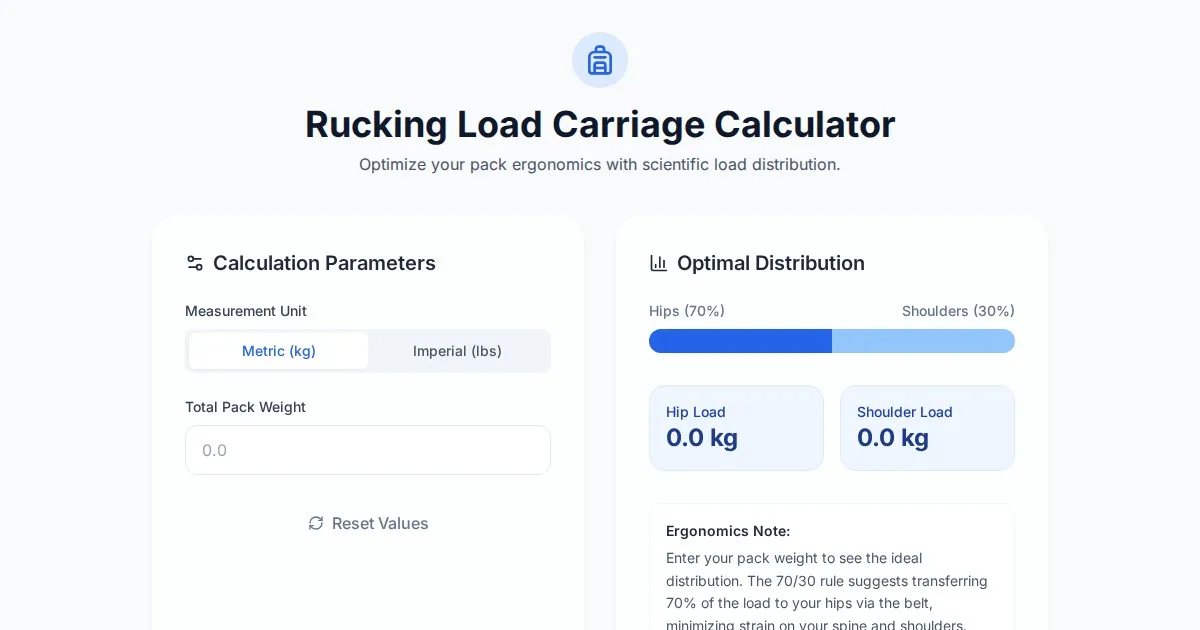
Free Rucking Weight Distribution Calculator & Ergonomics Tool
Calculate the ideal weight distribution between hip belts and shoulder straps for rucking. Improve ergonomics, prevent back pain, and optimize load carriage.
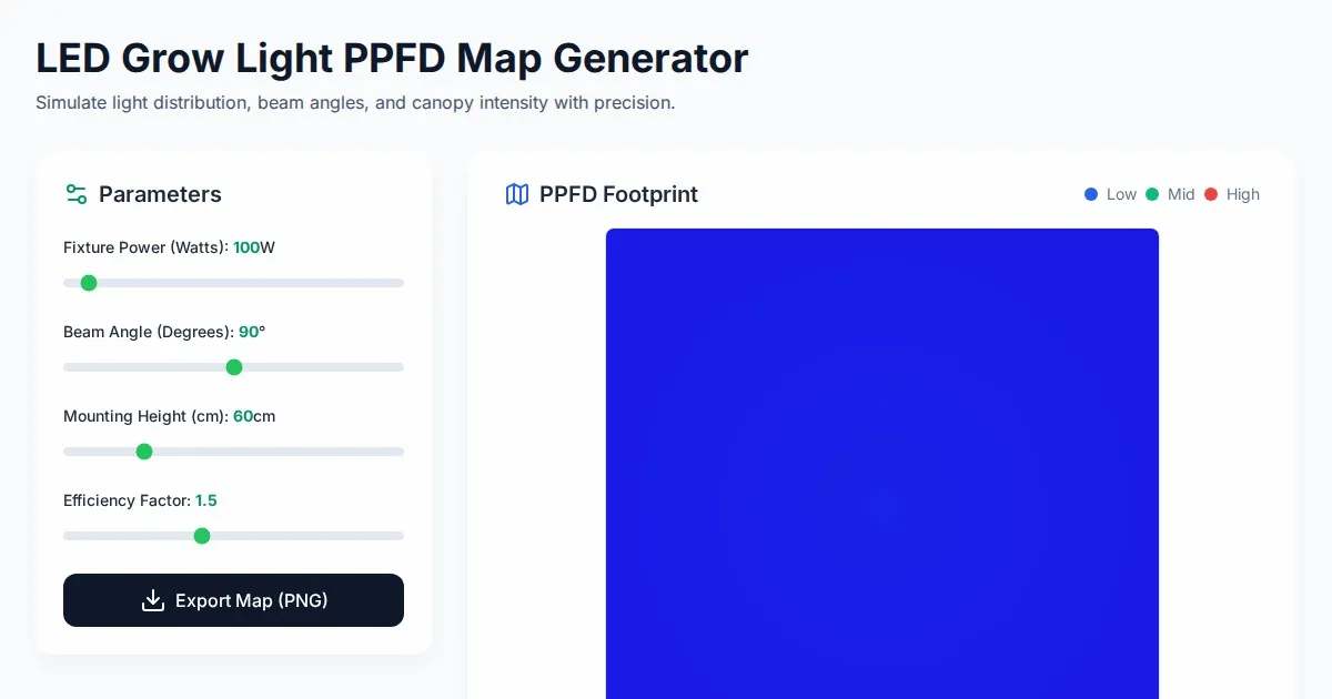
Free LED Grow Light PPFD Map Footprint Generator Tool
Create accurate LED grow light PPFD footprint maps. Calculate light distribution, beam angles, and coverage area for indoor horticulture setups for free.
Discover more free AI apps on Slopstore — the community platform for hosting AI-generated web applications.