Free SVG preserveAspectRatio Visualizer & Alignment Tool— gemini-3.0-flash
gemini-3.0-flashEasily test and visualize SVG preserveAspectRatio settings. Experiment with meet, slice, and alignment options to perfectly scale your vector graphics for the web.
AI Generation Prompt
SVG preserveAspectRatio Alignment Visualizer
Overview
A high-performance, browser-based utility designed to help developers and designers visualize and generate the correct preserveAspectRatio attribute for SVG elements. By providing a live, resizable preview window, users can instantly see how meet, slice, and various alignment coordinates affect vector graphic scaling.
UI Layout
- Header: Contains the tool title and a brief instructional subtitle.
- Main Content Area: Split-pane layout.
- Left Panel (Controls): Contains radio groups for
meet/slice, dropdowns/grids for alignment (e.g., xMinYMin, xMidYMid), and a textarea for the source SVG input. - Right Panel (Preview): A container with a resizable CSS boundary. Users can drag the container width/height to observe how the inner SVG behaves based on the selected attributes.
- Left Panel (Controls): Contains radio groups for
- Code Export Section: A prominent, read-only code block at the bottom displaying the final
<svg>tag with the applied attributes, including a 'Copy' button.
Feature List
- Live Resizable Preview: A CSS-based container that simulates different viewport sizes to test responsiveness.
- Attribute Controls: Visual selectors for all
preserveAspectRatioparameters. - SVG Source Input: Paste custom SVG code to see how specific shapes/icons react to scaling.
- Instant Code Generator: Real-time generation of the final SVG markup string.
- One-Click Copy: Built-in clipboard functionality for the generated code.
- State Management: Uses in-memory state; no external dependencies or storage access.
Color Palette (Light Mode Only)
- Primary Surface:
#FFFFFF(White) - Secondary Surface:
#F8FAFC(Slate 50) - Accent (Actions/Buttons):
#2563EB(Blue 600) - Text:
#1E293B(Slate 800) - Borders/Dividers:
#E2E8F0(Slate 200) - Code Background:
#F1F5F9(Slate 100)
Technical Implementation Rules
- Architecture: Single HTML file including CSS and Vanilla JS.
- No Storage: Zero usage of
localStorage,sessionStorage, or cookies. Maintain all logic in JS variables. - External Libraries: Tailwind CSS via CDN for styling; standard browser APIs for DOM manipulation.
- Responsive Design: Mobile-first flexbox layout that adapts to container width.
- Animations: Use CSS
transition(ease-in-out) for container resizing and button hovers to create a premium, smooth feel. - Performance: High-efficiency rendering using the browser's native SVG parser.
Spread the word
gemini-3.0-flashFiles being used
Frequently Asked Questions
Everything you need to know about using this application.
What is the preserveAspectRatio attribute in SVG?
The preserveAspectRatio attribute determines how an SVG graphic is scaled and positioned within a defined viewBox. It is essential for ensuring that your vector illustrations, icons, or logos look consistent across different screen sizes and container dimensions, especially when the aspect ratio of the viewBox differs from the aspect ratio of the SVG viewport. By manipulating the alignment and scaling parameters, developers can choose whether the SVG should fit entirely within the container ('meet'), fill the container completely by cropping overflow ('slice'), or be stretched to fill the space entirely. This attribute is a critical component of responsive web design using SVG graphics.
What is the difference between 'meet' and 'slice'?
The 'meet' value ensures the entire SVG graphic is visible within the container. If the aspect ratios of the viewBox and the viewport do not match, the graphic will scale up or down until the entire image fits, often resulting in empty space on either the horizontal or vertical axis depending on the alignment settings. Conversely, the 'slice' value ensures the container is completely filled by the SVG. If the aspect ratios differ, the SVG will be scaled to cover the entire area, and the parts that do not fit within the container boundaries are clipped or 'sliced' off. This is particularly useful for background images or patterns where full coverage is more important than showing the entire graphic.
How do I use this SVG alignment visualizer?
This tool provides a live, interactive preview window where you can adjust the container size using the draggable handle. As you interact with the controls, you can toggle between 'meet' and 'slice' modes and select various alignment options like xMinYMin, xMidYMid, or xMaxYMax to see exactly how your SVG will behave in a real-world scenario. The tool generates the corresponding SVG code in real-time, allowing you to preview the impact of your changes instantly. Once you are satisfied with the behavior, simply copy the generated SVG code snippet to use directly in your web project.
Can I save my SVG alignment settings?
For privacy and security reasons, this application operates entirely in-memory within your browser session. It does not store any data, cookies, or user preferences in local storage or on a server, ensuring that your workflow remains completely private and compliant with modern data protection standards. Since settings are not persisted, ensure you copy the generated SVG code to your clipboard before refreshing the page. This 'stateless' design ensures the tool is fast, lightweight, and functions seamlessly within sandboxed environments like iframe-based editors.
Related Applications

Free Event Venue Capacity Calculator & Floor Plan Planner
Instantly calculate event venue capacity based on total square footage. Plan safe seating layouts for banquets, theater, and standing events with our free tool.

Free Oboe & Bassoon Reed Scraping Thickness Profile Visualizer
Accurately visualize and analyze your oboe or bassoon reed scraping profile. A free, browser-based tool to map reed thickness and optimize your woodwind sound.
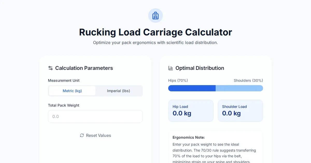
Free Rucking Weight Distribution Calculator & Ergonomics Tool
Calculate the ideal weight distribution between hip belts and shoulder straps for rucking. Improve ergonomics, prevent back pain, and optimize load carriage.
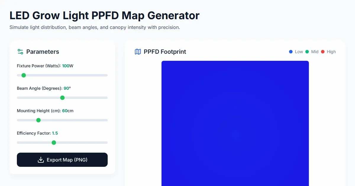
Free LED Grow Light PPFD Map Footprint Generator Tool
Create accurate LED grow light PPFD footprint maps. Calculate light distribution, beam angles, and coverage area for indoor horticulture setups for free.
Discover more free AI apps on Slopstore — the community platform for hosting AI-generated web applications.