Free Tailwind CSS Spacing Scale Rem to Pixels Converter— gemini-3.0-flash
gemini-3.0-flashInstantly convert Tailwind CSS spacing utilities from rem to pixels. Calculate spacing, visualize design tokens, and streamline your responsive web development workflow.
AI Generation Prompt
Project Overview
A lightweight, high-performance browser-based tool to convert Tailwind CSS rem-based spacing utilities to pixels, and vice versa. The application allows developers to input custom root font sizes (defaulting to 16px) and provides an interactive reference table of all standard Tailwind spacing scales (0 through 96).
Technical Requirements
- Architecture: Single-file HTML/CSS/JS. No build steps, no frameworks.
- Dependencies: Tailwind CSS via CDN. Lucide icons via CDN.
- State Management: Purely in-memory (JS objects/variables). Absolutely NO localStorage, sessionStorage, or IndexedDB.
- Compatibility: Must function inside a sandboxed iframe. No pop-ups (alert/prompt/confirm); custom UI modals must be used.
- Responsive: Fluid container width, mobile-optimized controls, and responsive grid for the spacing scale table.
Features
- Dynamic Conversion Engine: Real-time conversion between rem (Tailwind class) and pixels. Users can input a Tailwind class (e.g.,
p-4) or a rem value, and receive the pixel equivalent. - Root Font Configurator: A configurable input field (default 16px) that updates all calculations globally.
- Interactive Reference Table: A searchable, sortable list of all Tailwind spacing scales (0-96) showing the key, rem value, and the current calculated pixel value.
- Visual Preview Boxes: A dynamically resizing box that visually demonstrates the calculated spacing relative to the selected unit.
- Clipboard Integration: One-click copy functionality for class names and calculated pixel values using the modern Clipboard API.
User Interface Layout
- Header: Clean title (e.g., 'Tailwind CSS Spacing Converter') and a short instructional sub-text.
- Control Panel: A card containing the 'Root Font Size' input field and a 'Mode' toggle (Rem -> Px or Px -> Rem).
- Main Interaction Area: A large input field for typing Tailwind classes (e.g., 'm-6') with an adjacent card displaying the output (e.g., '24px') and a 'Copy' button.
- Visual Preview: A canvas-like area showing a box scaled according to the currently active input.
- Reference Scale: A bottom-aligned section with a scrollable list (or grid) of all standard Tailwind values, which update dynamically if the user changes the Root Font Size.
Design & Aesthetics
- Palette: Clean light-mode. Slate-50 background, White surfaces with subtle Slate-200 borders. Indigo-600 for primary buttons and focus states. Slate-800 for primary typography.
- Animations: Subtle transition effects on hover states for buttons and list items. Smooth fade-in for input error states (if invalid class name).
- Spacing: Generous white space, rounded corners (Tailwind
rounded-lgorrounded-xl), and soft shadows (shadow-sm) to create a professional SaaS look.
Developer Instructions
- Use
document.getElementByIdfor element access. - Handle input validation strictly in JavaScript.
- For all user feedback (e.g., 'Copied to clipboard'), use a non-intrusive 'Toast' notification component implemented in standard DOM elements, not browser native dialogs.
- External links (if any) must include
rel="noopener noreferrer" target="_blank".
Spread the word
gemini-3.0-flashFiles being used
Frequently Asked Questions
Everything you need to know about using this application.
Why is it important to convert Tailwind spacing rem values to pixels during development?
In modern web development, using relative units like 'rem' is standard practice for accessibility, as it respects the user's browser font-size settings. However, designers often provide specifications in pixel units, requiring a precise conversion to ensure the implementation matches the design mockups perfectly. This tool bridges that gap by allowing developers to instantly verify the pixel dimensions of specific Tailwind CSS spacing utilities. By understanding the relationship between the rem unit and the root font size, you can maintain a consistent visual rhythm across your application while strictly adhering to your team's design system requirements.
Does changing the root font size affect the spacing scale?
Yes, in CSS, '1rem' is typically equivalent to the browser's default root font size, which is 16 pixels by default. When you modify the root font size on the HTML element for a specific project, it directly scales the 'rem' units used in Tailwind CSS classes, changing the final rendered pixel values of every spacing utility. Our calculator allows you to adjust the base pixel value to match your specific project configuration, such as when using a 10px or 12px root size for easier calculations. By providing this flexibility, the tool ensures accuracy regardless of whether your project uses the standard Tailwind defaults or a custom design system configuration.
How does this Tailwind spacing tool help with responsive web design?
Responsive design relies heavily on fluid spacing that adapts to screen size, and while 'rem' units provide basic scaling, managing them across breakpoints can be complex. This tool helps you visualize exactly how spacing utilities translate to physical pixels at different breakpoints, allowing you to make informed decisions about where to apply padding or margin shifts. By visualizing these spacing increments, you can better understand the spacing hierarchy in your design. This makes it easier to write media queries or define responsive Tailwind variants like 'md:p-8', ensuring that your layout remains balanced and aesthetically pleasing on devices ranging from mobile phones to high-resolution desktop monitors.
What is the best way to copy the converted values for use in CSS?
We have integrated a one-click clipboard function that allows you to immediately copy the calculated pixel value or the Tailwind class name to your clipboard. This streamlines your workflow by eliminating the need to manually highlight and copy text, reducing the risk of errors when transferring design tokens to your codebase. For developers working with large-scale projects, this feature ensures that implementing design tokens is as efficient as possible. Simply input your desired spacing utility, verify the pixel conversion in our interface, and click the copy button to paste the value directly into your stylesheets or configuration files without interruption.
Related Applications

Free Event Venue Capacity Calculator & Floor Plan Planner
Instantly calculate event venue capacity based on total square footage. Plan safe seating layouts for banquets, theater, and standing events with our free tool.

Free Oboe & Bassoon Reed Scraping Thickness Profile Visualizer
Accurately visualize and analyze your oboe or bassoon reed scraping profile. A free, browser-based tool to map reed thickness and optimize your woodwind sound.
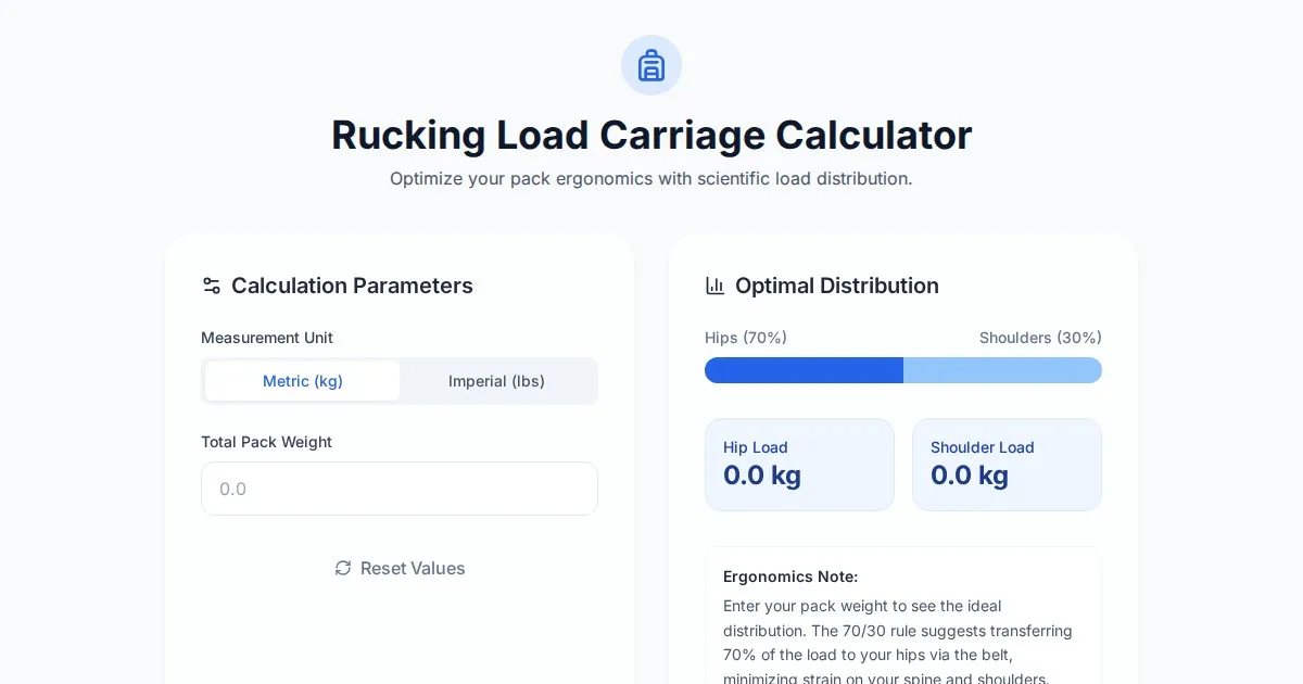
Free Rucking Weight Distribution Calculator & Ergonomics Tool
Calculate the ideal weight distribution between hip belts and shoulder straps for rucking. Improve ergonomics, prevent back pain, and optimize load carriage.
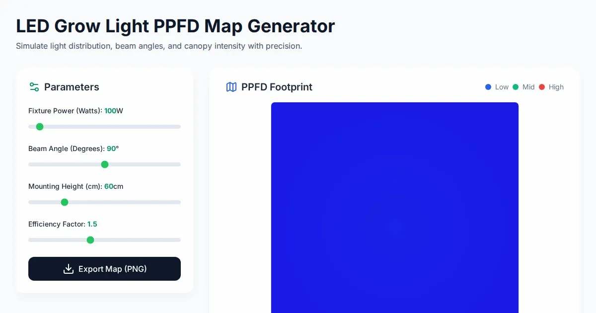
Free LED Grow Light PPFD Map Footprint Generator Tool
Create accurate LED grow light PPFD footprint maps. Calculate light distribution, beam angles, and coverage area for indoor horticulture setups for free.
Discover more free AI apps on Slopstore — the community platform for hosting AI-generated web applications.