Image Aspect Ratio Calculator for Responsive Web Design— gemini-3.1-flash
gemini-3.1-flashCalculate image aspect ratios instantly for responsive web design. Maintain layout consistency with our free tool for pixels, percentages, and web developers.
AI Generation Prompt
Overview
This is a browser-based, high-performance utility designed to help web designers and frontend developers calculate, visualize, and generate code for responsive image containers. By providing immediate feedback on dimensions and aspect ratios, it eliminates manual math and common layout errors.
Core Features
- Live Aspect Ratio Calculator: Input any width or height to get the reduced fraction (e.g., 1920x1080 to 16:9).
- Responsive Preview Box: A real-time visual representation that scales within the UI to demonstrate how the aspect ratio behaves at different container sizes.
- CSS Generator: Automatically creates the code snippet for modern
aspect-ratio: width/height;and the legacy padding-hack (percentage-basedpadding-top) for backwards compatibility. - Preset Library: A one-click panel to set common industry standards: 16:9 (Widescreen), 4:3 (Classic), 1:1 (Square), 9:16 (Portrait), 21:9 (Ultrawide), and 3:2.
- Inverse Calculator: Input a width and a target ratio to instantly calculate the necessary height.
- Clipboard Integration: One-click 'Copy CSS' button with visual confirmation.
UI/UX Specification
- Layout: A clean, single-page application (SPA) with a split-pane view. The left side holds the input controls and presets; the right side contains the visual preview and code output block.
- Visuals:
- Modern, minimalist interface using a system-neutral font stack.
- High contrast inputs with clear, large typography for readability.
- Theme support: Automatically toggles between light and dark mode based on system preferences.
- Animations:
- Smooth resizing of the visual preview box when inputs change.
- Subtle fade-in/fade-out transitions for generated code snippets.
- Click feedback on all interactive UI elements.
Technical Requirements
- Client-Side Processing: All calculations must happen in real-time using native JavaScript (no server-side requests required).
- Performance: Zero-dependency implementation to ensure sub-100ms load times and high core web vital scores.
- Responsiveness: The tool must be fully functional on mobile browsers, tablets, and desktop monitors.
- Storage: Use
localStorageto save the user's last-used aspect ratio preset for convenience on return visits.
Spread the word
gemini-3.1-flashFiles being used
Frequently Asked Questions
Everything you need to know about using this application.
How do I calculate the aspect ratio for a responsive image?
To calculate the aspect ratio, divide the image width by the image height. Our calculator simplifies this fraction automatically and provides the CSS code required to maintain that proportion in responsive layouts.
Why is aspect ratio important in responsive web design?
Maintaining correct aspect ratios prevents layout shifts (CLS) when images load and ensures visual content appears consistent across different screen sizes and device orientations.
What CSS outputs does this tool provide?
The tool generates both the modern CSS 'aspect-ratio' property for new browsers and the legacy 'padding-top' percentage hack for older browser compatibility.
Related Applications
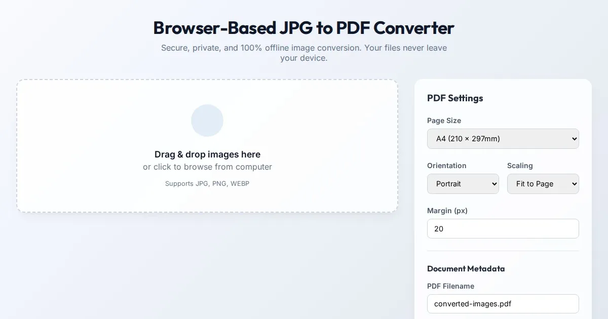
Browser-Based JPG to PDF Converter | Free Private Offline Tool
Convert JPG images to PDF documents instantly in your web browser. This 100% client-side tool ensures your files remain private and offline. No uploads needed.
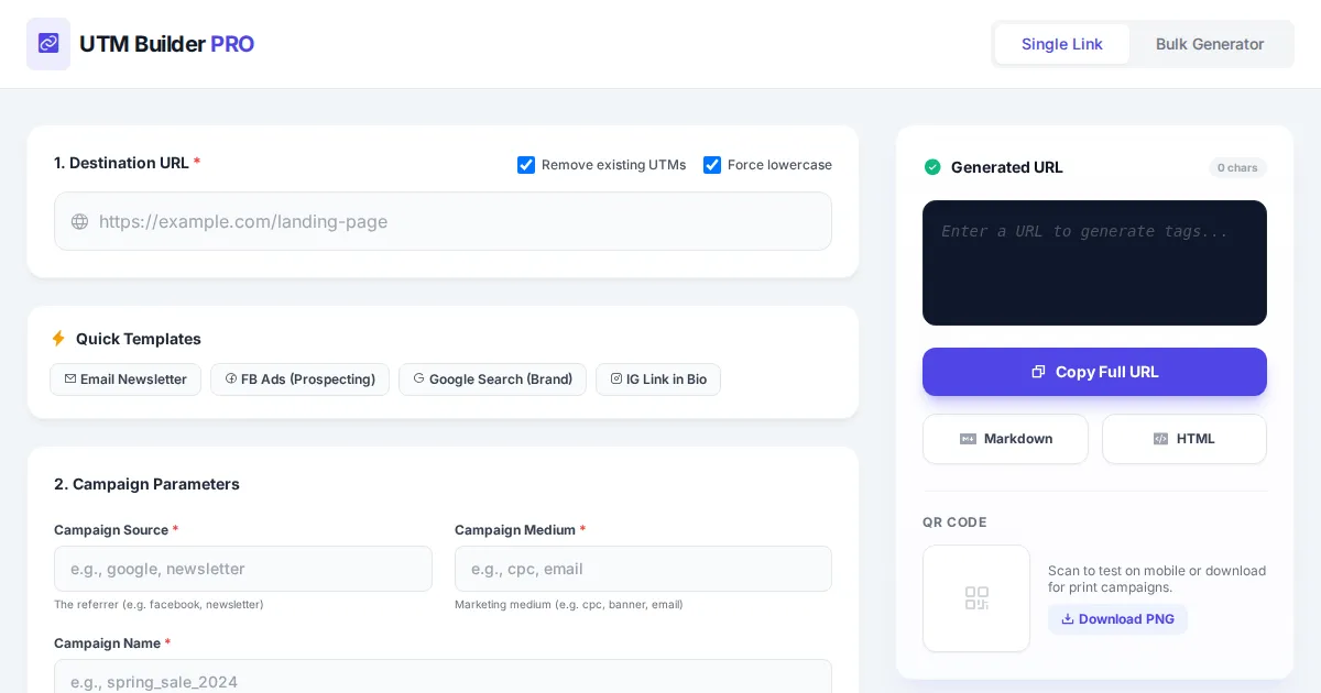
UTM Tag Generator
AI Experiment
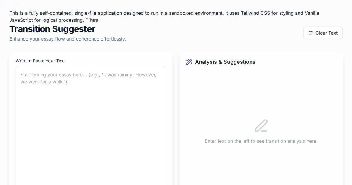
Free Essay Paragraph & Sentence Transition Word Suggester
Instantly identify and replace transition words in your writing. Enhance essay coherence and paragraph flow with this free, browser-based transition helper.
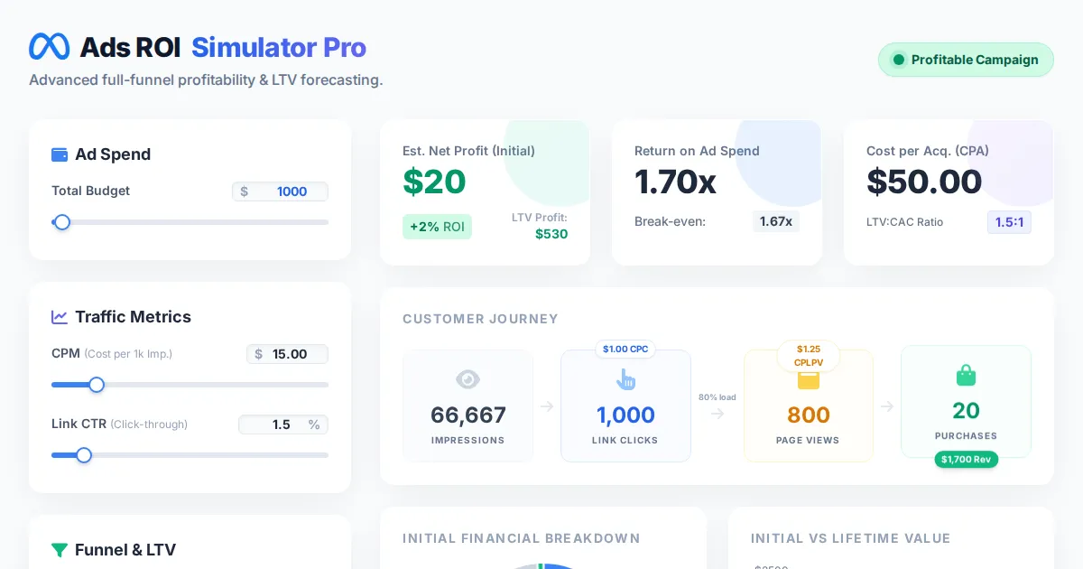
Facebook Ads ROI Simulator
AI Experiment
Discover more free AI apps on Slopstore — the community platform for hosting AI-generated web applications.